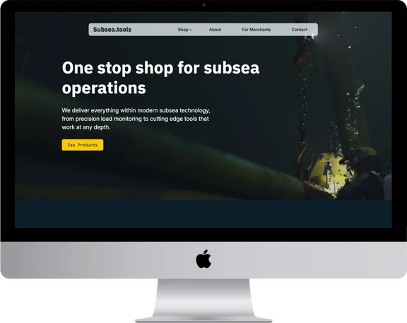
Subsea.tools
A One-Stop Shop for Subsea Operations
Introducing Subsea.tools
- Braaten Technology in Stavanger builds subsea weight-control equipment. Its flagship, the Subsea Load Monitor (SLM), gives real-time weight control at depth without a lift wire from the surface. Subsea.tools is their new umbrella brand: one shop where offshore buyers find, compare and request subsea equipment, starting with Braaten's own products.
- Starting point: A strong domain name, three products and no website. Founders Martin Johansen and Trygve Aleksander Årdal wanted something real to show at a subsea symposium in Brazil in late November.
- Project Brief & Objectives: Phase 1, a professional storefront: a modern front page, a WooCommerce product catalogue with categories and downloadable datasheets, and a quote request on every product. Phase 2, optional: open the shop to approved suppliers as a marketplace. Built so that a small team can add products without me.
- My Role: End to end: discovery workshop, competitor review, brand direction and stylescapes, sitemap, UX/UI in Figma, development in WordPress with WooCommerce and Breakdance, and launch.
- Key Tools & Timeline: Figma, Notion, WordPress, WooCommerce, Breakdance, one.com. Pitched in June 2025, kickoff workshop in early October, then designed and built between 26 October and 11 December 2025, part-time, with 68 logged hours. About, Contact and For Merchants were created later.
Process overview
- Sitemap and three stylescapes to land one direction
- A shop demo ready by 20 November
- Front page, categories and product pages first
- About, Contact and For Merchants in the next round
From my mail to the founders, 30 Oct 2025 (translated)"I'll start with the front page, categories and product pages so it's ready as fast as possible. Then I'll take About, Contact and For Merchants in the next round."
- Two stylescapes became three, and one direction was picked in a single round Done 10 Nov
- The demo deadline moved from 20 to 25 November Moved
- Three rounds of Figma drafts in three days Done 18 Nov
- Front page, shop, two categories and three product pages, behind a password for the trip Shipped 11 Dec
- About, Contact and For Merchants Shipped 2026
- 01 · 26.06–01.07 Pitch Competitor research, stack choice and a phased proposal.
- 02 · 03.10–10.11 Discovery & direction Kickoff workshop, competitor review, sitemap, three stylescapes and a decision.
- 03 · 11.11–18.11 Setup & design Hosting, Breakdance, an imagery brief and three rounds of drafts.
- 04 · 21.11–25.11 Build Front page, shop, categories and product pages behind a password.
- 05 · 11.12–19.12 Launch Password removed, then two products marked "coming soon" at the CEO's request.
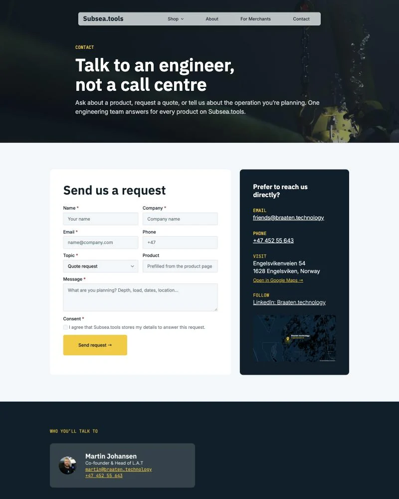
- 06 · 2026 Sprint 2 About, Contact and For Merchants, with one request form for the whole site.
- Build 40 h
- Brand & design 14 h
- Setup & hosting 9 h
- Research & structure 4 h
- Launch 1 h
Discovery: One Shop Instead of Five Phone Calls
A workshop to kick off
In early October I ran a kickoff workshop with Martin, with printed sheets for a user-centred design canvas, personality sliders, How Might We questions and a brand pyramid. His word for the gap was a "one stop shop": nobody in the industry offers one, because engineers, buyers and suppliers each sit on their own island. Subsea.tools should be that place, and the name is exactly what buyers type into Google.
What the competitors do
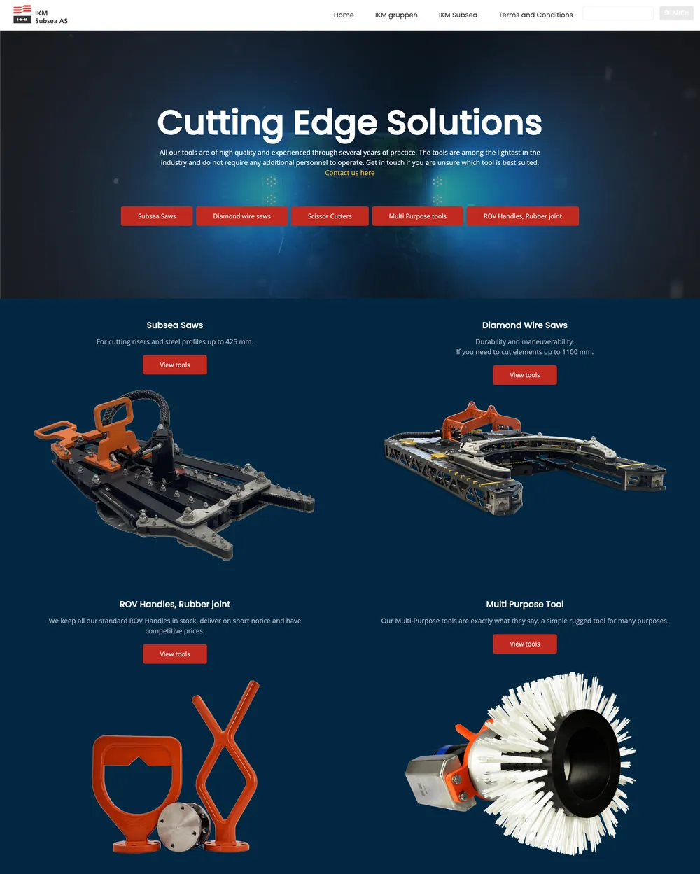
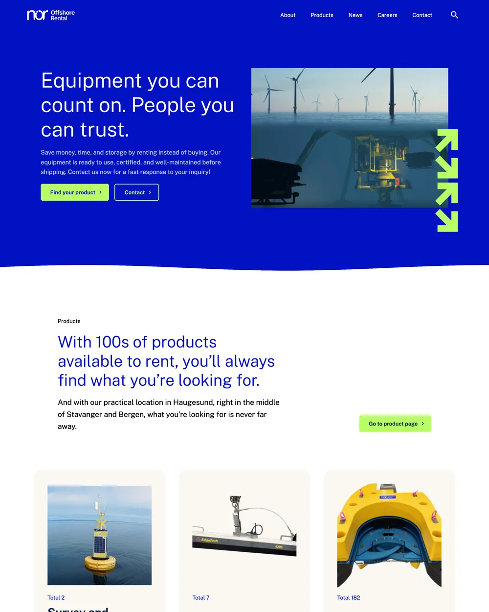
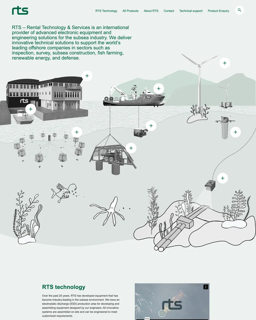
I went through Norwegian Offshore Rental, Ashtead Technology, RTS, Pronomic, Envirent and IKM Subsea, which already runs subseatools.no. Almost all of them sell through a catalogue and a "request a quote" button. They speak only to oil and gas, while Braaten also saw demand in offshore wind, aquaculture and subsea mining. And the tone is corporate, where the founders wanted to come across as human and direct.
Mapping the buyer
In the workshop I worked through the questions from a user-centred design canvas with Martin: what drives the engineers and buyers who would use the shop, what they fear, and what they need. Trust came out on top: when a supplier fails to deliver on a large subsea project, the client pays for the downtime.
- Motivation Save time and money, and find suppliers they can rely on.
- Fears Equipment that fails, late or wrong deliveries, and suppliers who disappear.
- Needs Trust, stability and a professional first impression.
- Answer One place with clear specs, downloadable datasheets, and one engineering contact who handles the dialogue with every supplier.
We also landed on three audiences, not one: buyers, the suppliers who would list their products later, and the partners and clients they meet at conventions in Norway and Brazil.
Brand Direction: Hel Ved
Martin described the way he works as hel ved, a Norwegian expression for someone solid and genuine all the way through. In the workshop we talked the brand through personality sliders: elite, but reaching a little toward mass appeal; serious, but pulled a little toward playful; and leaning rebel, as challengers in a conservative industry without going all the way.
Three stylescapes, one round
I started with two stylescapes, then added a third on 28 October: lighter, more minimal and more expressive, because the founders wanted to be serious rebels who challenge the industry rather than blend in. On 30 October I sent all three with the sitemap, so they could react to something concrete before anything was built.
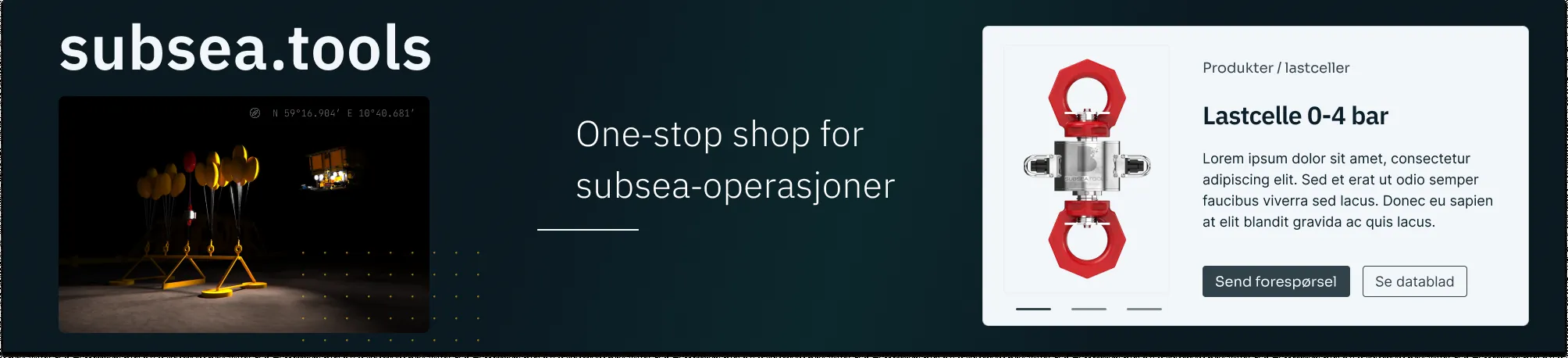
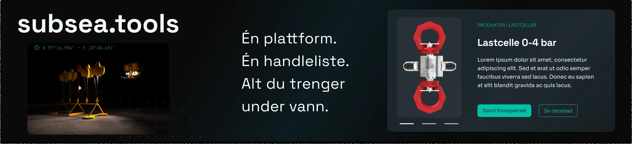
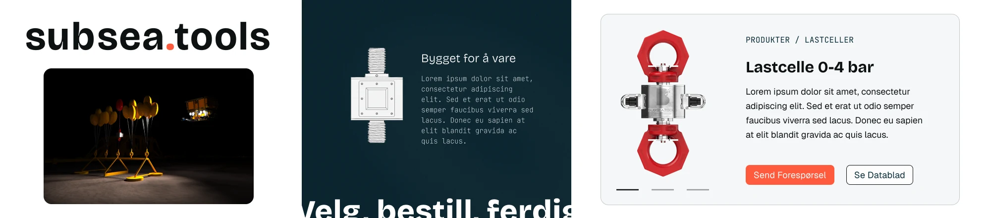
"I've given Anders the go-ahead based on 'Hel ved', which you liked, Trygve."
Martin Johansen to Trygve Aleksander Årdal, 10 Nov 2025 (translated)
It was a good choice: the direction closest to how they describe themselves, and solid enough for buyers who need to trust the equipment. With one clear decision, the fonts and colours could go straight on to their own designer and into the build.
The Final Direction: Clean + Heritage
"Hel ved" carried straight into the build: mature, robust, reliable and precise. A clean industrial look with warm details, and safety colours used only where something needs attention.
Feeling
Calm authority from deep navy, with underwater photography for depth. Trust comes from order: clear specs, real renders and no clutter.
Typography
IBM Plex Sans for headlines, with an engineered feel. Inter for body text. JetBrains Mono for small technical labels and specs.
Logo
A simple wordmark for now. The full logo was still being decided while the stand for Brazil was printed.
Colour
- #0B1F2A Deep Navy. Backgrounds and hero
- #0E3B2E Sea Pine. Accent surfaces
- #32424A Steel Grey. Lines, icons, secondary buttons
- #F3F7F9 Foam White. Cards and light pages
- #F46A2E Beacon Orange. A sparse safety accent
- #F9C80E Subsea Yellow. Calls to action and tags
Structure & Design: Two Clicks to Any Product
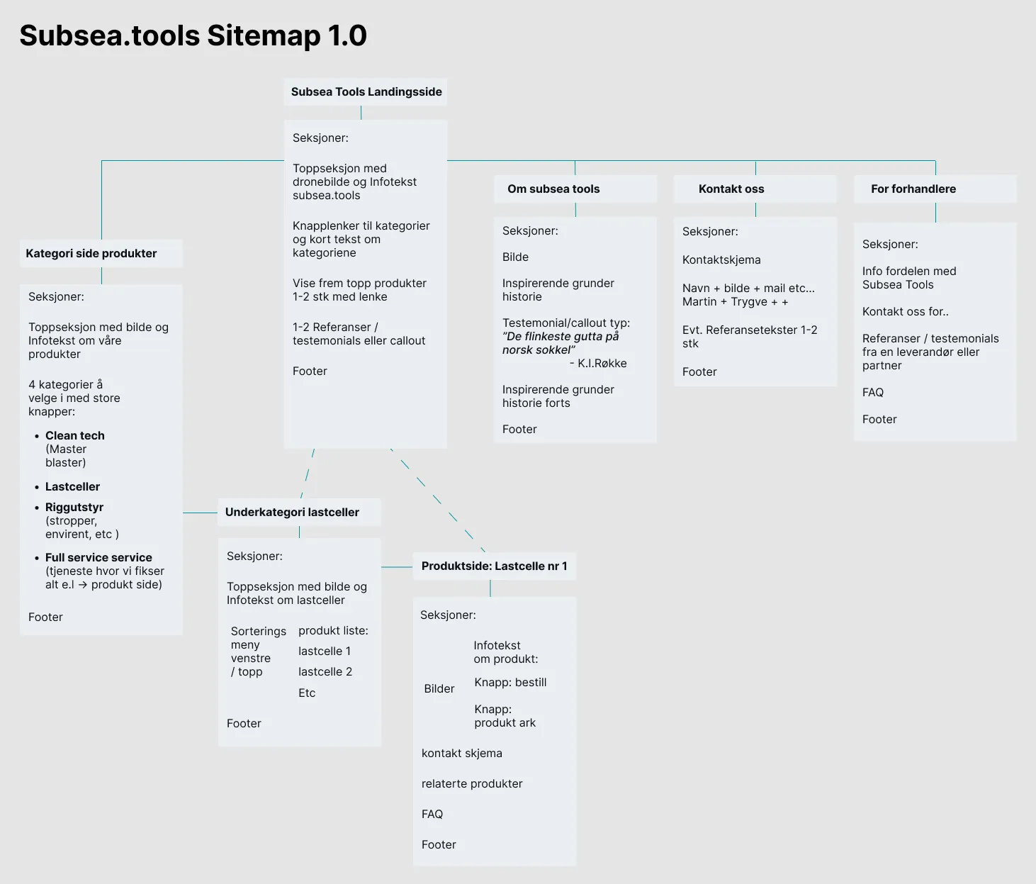
Sitemap 1.0
The sitemap kept the shop shallow: from the front page a buyer reaches a category and then a product. Every product page answers the same three questions: what it is, where the datasheet is, and who to ask. The sitemap also set the sprint split. Everything a buyer in Brazil would click came first; About, Contact and For Merchants came second.
Three drafts in three days
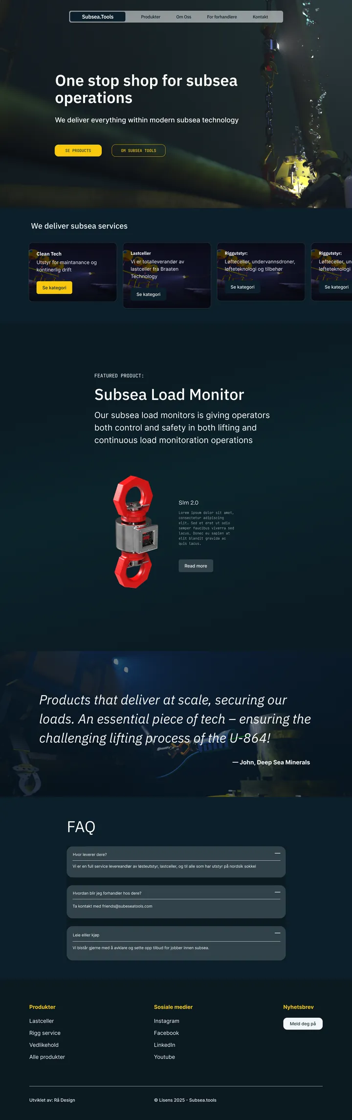
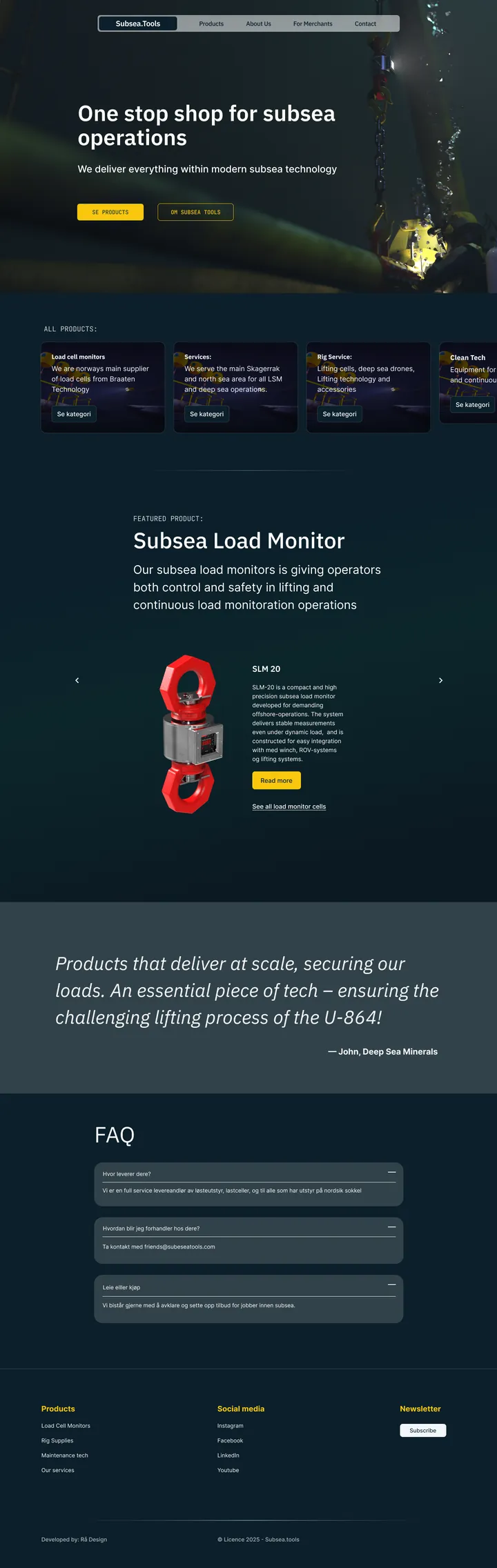
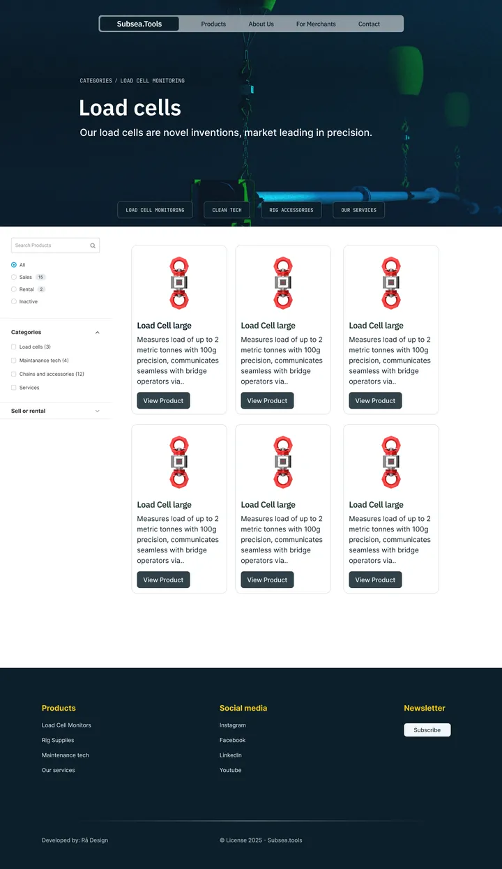
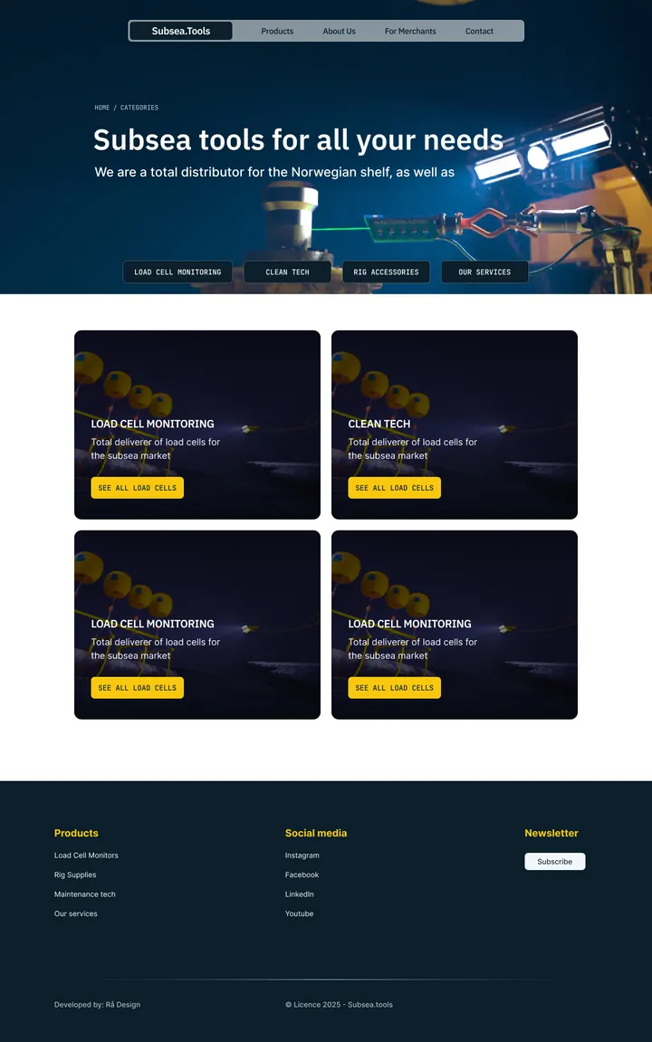
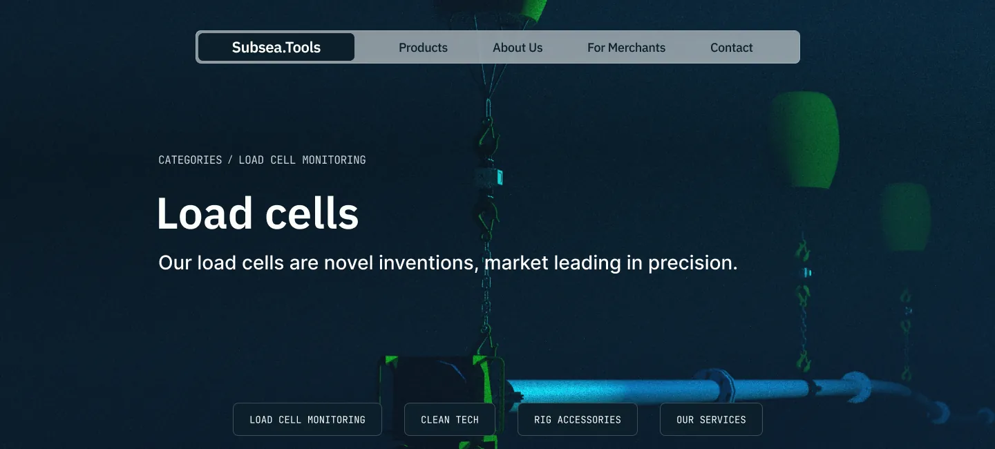
Between 16 and 18 November I went through three rounds in Figma of the front page, the category overview, a category page and a product page. The hero went dark and underwater, with an overlay so the headline stays readable. The categories became image cards, and the Subsea Load Monitor became the featured product.
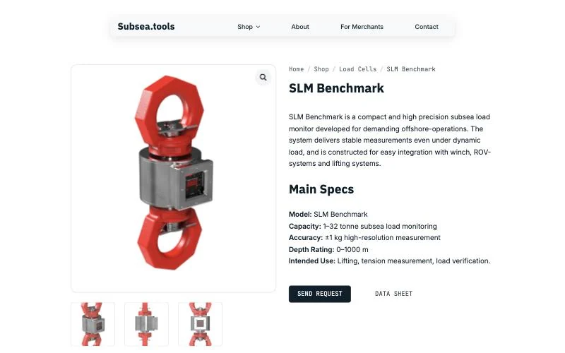
A product page built for engineers
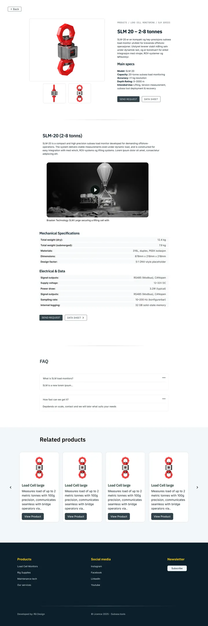
- Three-quarter render first. The gallery opens on an angle that shows the front and side at once.
- Key specs beside the image. Capacity, accuracy and depth rating, before any marketing copy.
- Two actions. "Send request" and "Data sheet", nothing else competing.
- Related products and FAQ to keep a buyer in the shop.
Renders were the real dependency
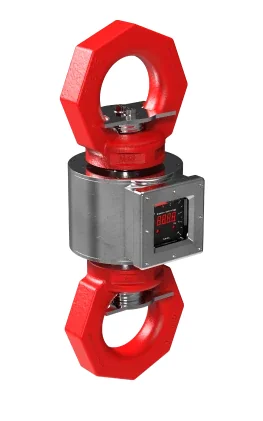
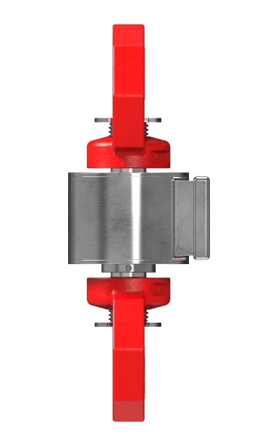
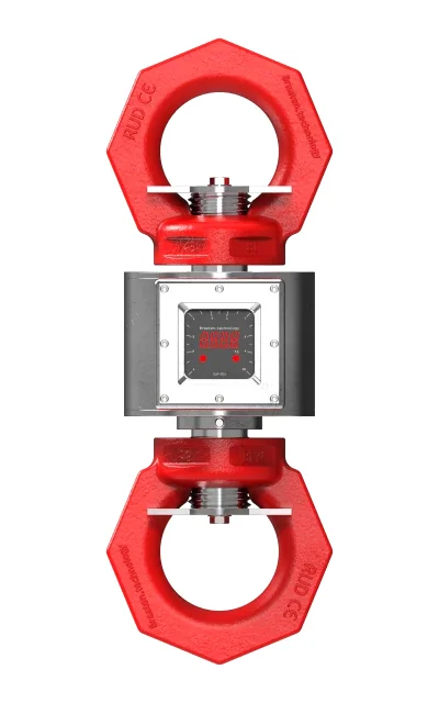
Good renders would decide whether the shop looked premium or homemade, so on 13 November I briefed Eirik, Braaten's engineer: SLA, SLM and MasterBlaster on a neutral background, front, side and a three-quarter view, plus hero material with depth and particles. I converted everything to WebP.
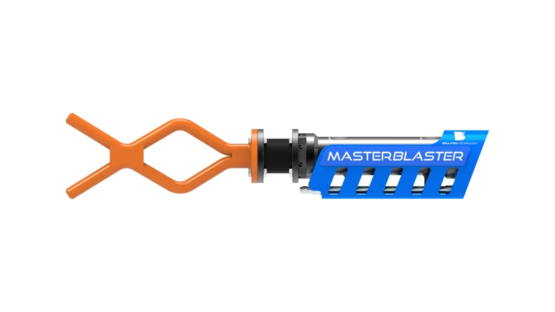
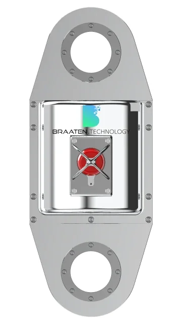
An interactive 3D model buyers can rotate and click for part details, built from a simplified CAD export with glTF and Three.js. The right idea, but the wrong moment: getting the shop live came first.
Building with WooCommerce and Breakdance
A real catalogue, in catalogue mode
WooCommerce gives Braaten a real product catalogue with categories, attributes and datasheets, and it can grow into a marketplace later without a re-platform. Version one has no prices or cart, just "Send request" on every product. That matches how the industry buys, and leaves room for prices on off-the-shelf items later, which the founders wanted.
Why Breakdance
I chose Breakdance for its tight WooCommerce integration and its focus on lean, fast output. It also keeps the site simple for Braaten's team to update on their own later.
Subsea was my first build in it. I had expected a library of ready-made blocks and found almost none, and I did not want to set padding by hand in every panel, so I brought my own utility classes into it.
Same CSS framework, new palette
I reused the utility-first framework I built for Autentisitet: design tokens as CSS custom properties, a flex row system and fluid type with clamp(). Moving it to Subsea meant swapping the palette and fonts, not writing new CSS.
:root {
  --color-deep-navy:     #0B1F2A; /* main background / hero */
  --color-sea-pine:      #0E3B2E; /* accent surfaces */
  --color-steel-grey:    #32424A; /* UI lines, icons */
  --color-foam-white:    #F3F7F9; /* light backgrounds, cards */
  --color-beacon-orange: #F46A2E; /* sparse "safety" accent */
  --color-subsea-yellow: #F9C80E; /* tags / alerts */
  --container-lg: 896px;
  --container-xl: 1120px;
}

.h1-display {
  font-family: 'IBM Plex Sans', sans-serif;
  font-weight: 600;
  font-size: clamp(2.8rem, 8vw, 4rem);
}
Built in Breakdance
An invite-only demo for Brazil
Until launch the shop sat behind a password and a noindex tag, so Martin could show it at the symposium in Brazil without Google indexing a half-finished shop. Getting the password protection to work on the host took a night of server errors on 25 November. The password came off on 11 December.
Hosting reality
The domain still held an abandoned one.com page-builder site. I moved it into an /old/ folder, installed WordPress by hand and spent an evening on DNS and database errors before the build could start. I'd budget for that next time.
Sprint 2: The People Behind the Shop
With the shop live, the next step was the company pages: About, Contact and For Merchants.
Discovery had shown that trust decides a purchase in this industry. So these pages put names and faces on the shop, and give buyers one place to ask.
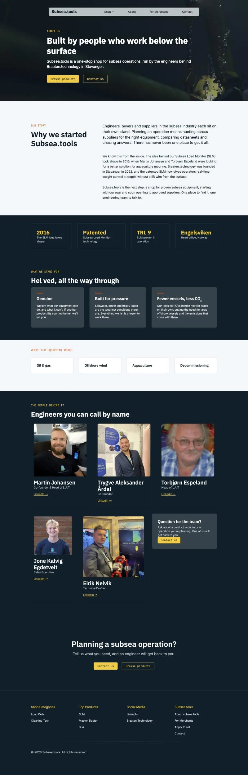
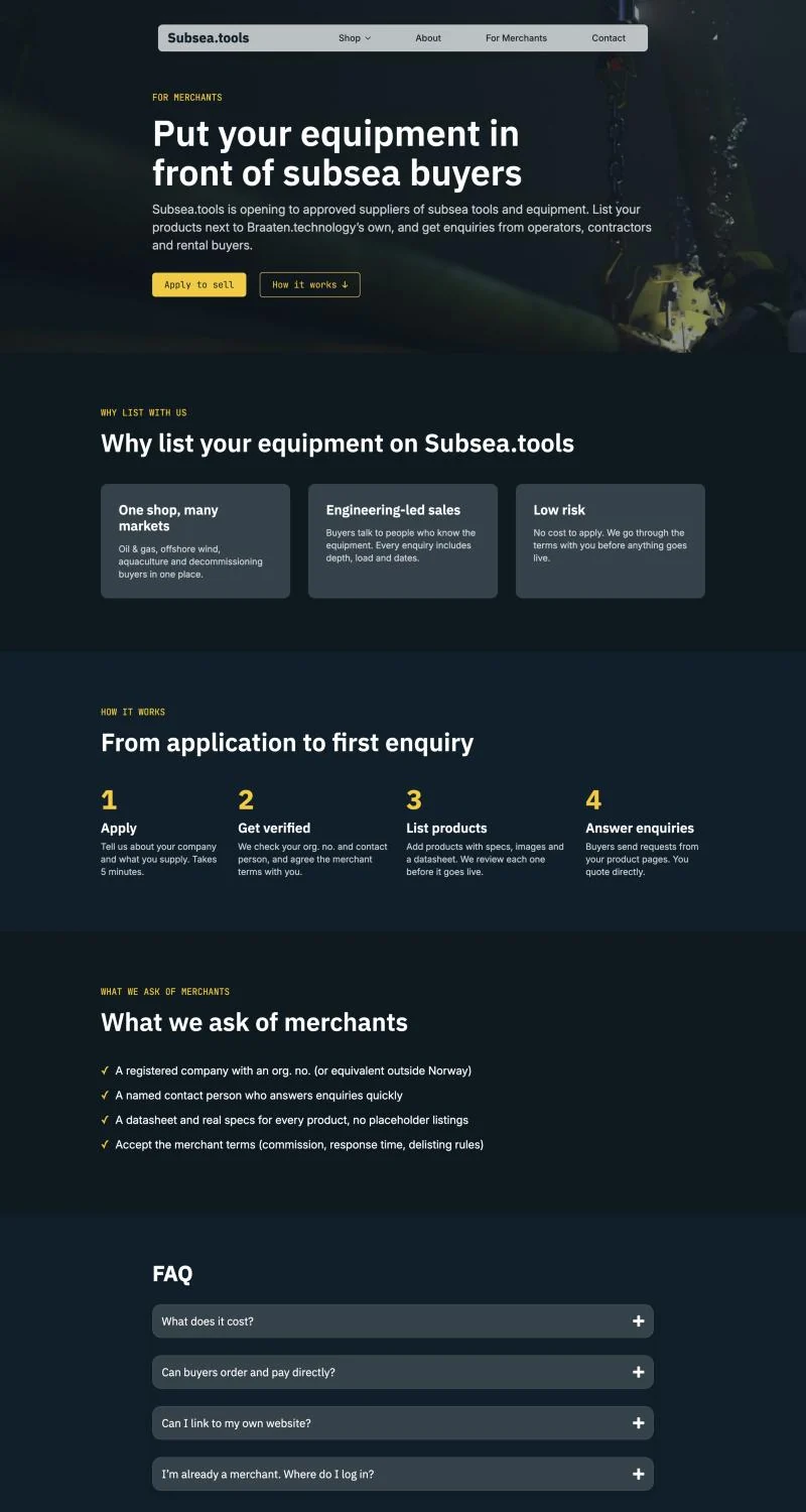
A marketplace without the junk
Martin's brief for suppliers was to be "Amazon for subsea tools" without what Amazon also attracts. On the page that became four plain requirements: a registered company, a named contact who answers quickly, a datasheet and real specs for every product, and accepted merchant terms. Every listing is reviewed before it goes live.
Results
Subsea.tools went public on 11 December 2025, inside the estimate from the June proposal: a front page, a shop, two categories (Load Cells and Cleaning Technology) and three products, each with specs, a gallery and a quote request. On 19 December Trygve asked to mark two of the three products "coming soon": he did not want to market products before they could be delivered.
PageSpeed Insights
Tested on 11 November 2026. On desktop all three pages score 99 or 100 for performance. On mobile the product page scores 95, while the front page and About sit just under 80: WooCommerce and Breakdance load scripts and styles that block the first paint, and the browser finds the hero image late. That is the next thing to fix.
- Front page Accessibility 98–100 · Best Practices 100 · SEO 100Desktop LCP 0.9 sMobile LCP 4.5 s
- SLM product page Accessibility 97 · Best Practices 100 · SEO 100Desktop LCP 0.6 sMobile LCP 2.3 s
- About page Accessibility 94 · Best Practices 100 · SEO 100Desktop LCP 0.9 sMobile LCP 4.5 s
Brand direction approved in one round, a password-protected demo for the Brazil trip, and a public storefront with a catalogue ready to take more suppliers when phase 2 starts.
About, Contact and For Merchants, with one request form and a single engineering team answering for every product on the site.
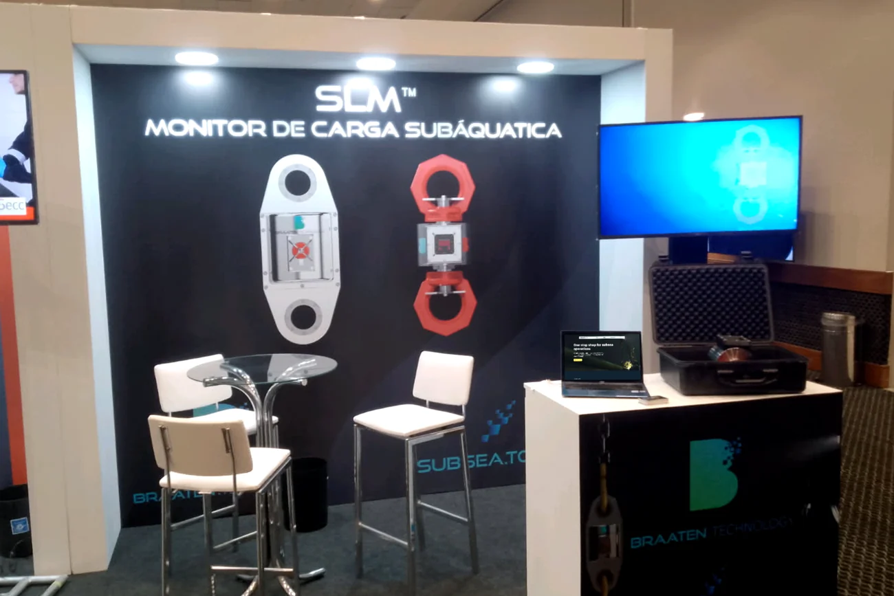
Seen in Brazil
In late November 2025 the demo travelled to a subsea symposium in Brazil, where Braaten showed the Subsea Load Monitor on their stand under both names: Braaten Technology and Subsea.tools.
Reflections & Learnings
- A deadline is a design tool. Asking "what does a buyer in Brazil click?" made the sprint split obvious and kept the demo focused.
- Start with a workshop. One session with printed canvases turned a free conversation into a brand direction, a buyer map and a sitemap.
- Clear options decide faster. On SMAB we needed three rounds of stylescapes. Here, three distinct directions got a decision in one.
- Reuse pays. Bringing my CSS framework from Autentisitet made the build mostly configuration.
- Breakdance is a great fit for WordPress. It is fast to build in and capable of 100/100 PageSpeed scores, and easy enough that the client can handle updates later with a short training. And it comes without the bloat and hidden costs of many other builders.
- Plan for the deadline moving. The demo slipped from 20 to 25 November, and a week out I was still in Figma and new to Breakdance. Cutting Figma time and designing in the builder got it over the line.
- Brief content dependencies on day one. Renders and the logo sat with the client's team, so asking early meant they arrived in time to build around.