Autentisitet.no
Brand, Design & a 100/100 Bricks Build
Introducing Autentisitet.no
- Andreas Aubert is a life coach, psychotherapist and group facilitator. Through Autentisitet.no he offers a 12-week one-to-one programme, breathwork groups and courses, and men's groups. It started with events: in July 2025 we hosted Freedom Breathwork in the garden of my shared house, and in September a second session followed "by popular demand".
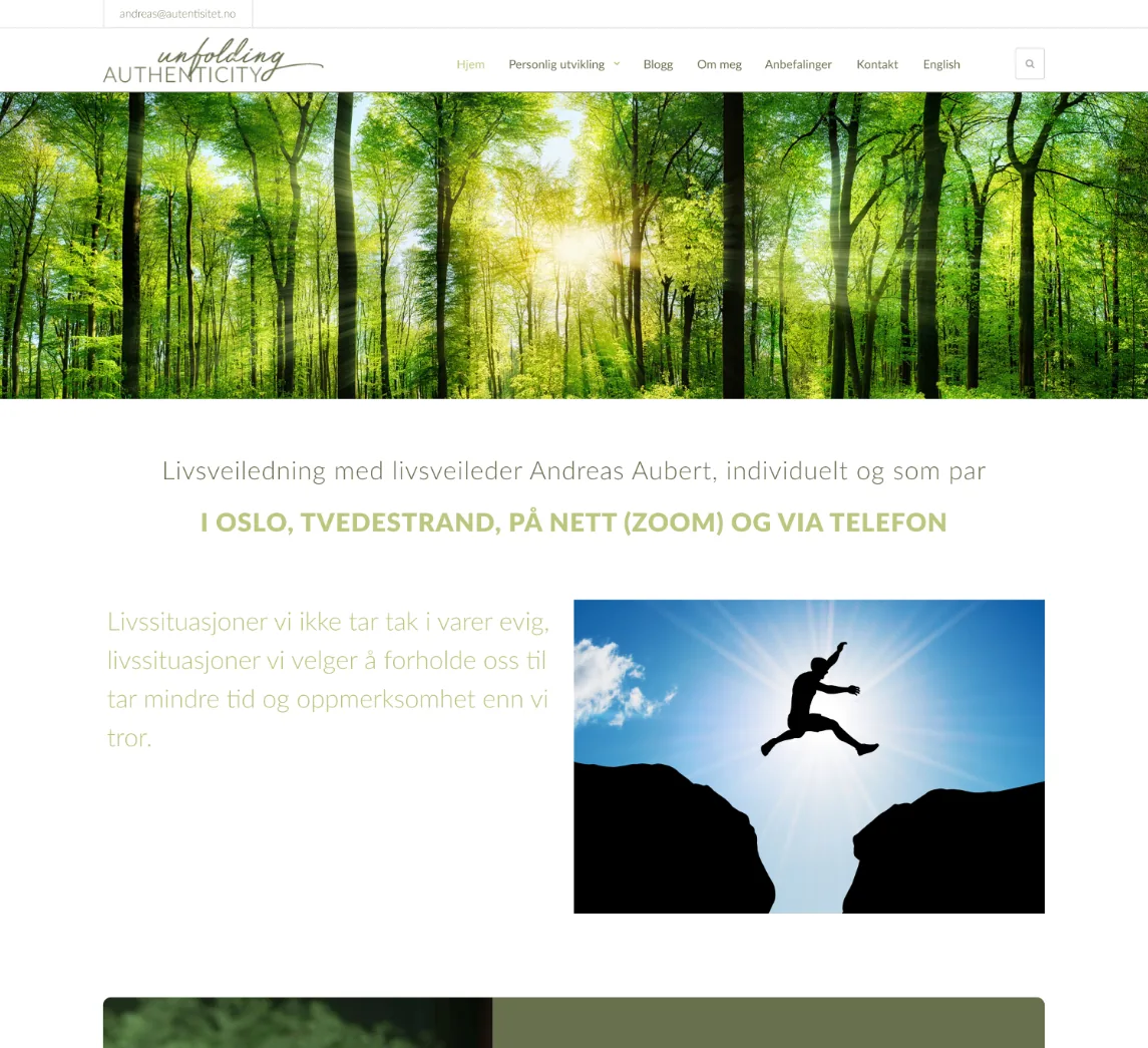
- Starting point: The old site still went by "Unfolding Authenticity", ran on a dated WordPress theme and leaned on stock photos, with Lato and a pale olive palette. It said little about what Andreas actually offers.
- Project Brief & Objectives: Rebuild autentisitet.no to strengthen Andreas' brand and help him succeed with his programme, groups and events. Stay on WordPress to keep his content, SEO and costs. Our meeting on 7 September set the rules: speak to "you", not about "me", keep the menu short, swap stock and AI images for real photos, make one clear action (book a paid trial session), and launch first, then polish.
- My Role: End to end: brand workshop, stylescapes, UX/UI in Figma, user testing, development in WordPress with Bricks, SEO and launch. Beyond the website I gave his social media manager, Social by Malene, the visual profile to work from, designed event banners and co-hosted the breathwork sessions we also used as photo shoots.
- Key Tools & Timeline: Figma, Notion, WordPress, Bricks, PageSpeed Insights, Search Console, Hotjar. 18 August to 7 November 2025, about 12 weeks. In 2026 I added an events calendar and a blog, and moved the newsletter to Mailchimp.
Process overview
- A short workshop: personality sliders, value pyramid, maybe a User Centered Design Canvas
- Stylescapes to explore the visual language
- A style guide / brand book
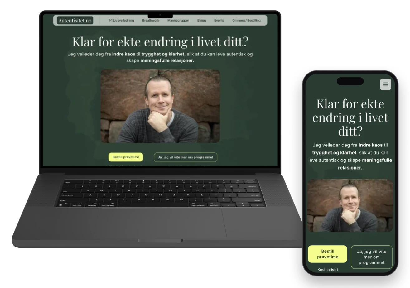
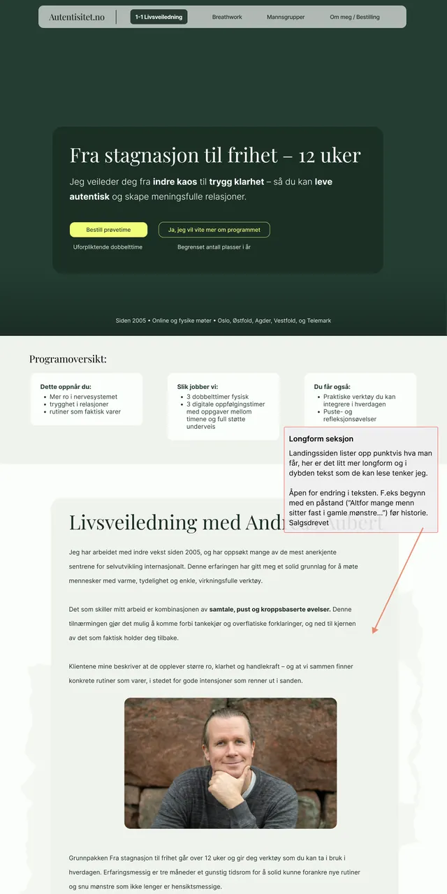
- The landing page
From my follow-up mail to Andreas, 9 Aug 2025 (translated)"The first three steps we can do lightly and quickly – enough to anchor the choices in values without locking us in."
- Personality sliders with Andreas Done
- Stylescapes in two rounds (two, then six), narrowed to three directions and one final palette Done
- A brand document with palette, type and rationale, so the brand stays consistent on every platform Done
- Landing page, then four subpages, a full build, SEO and launch Shipped 17 Oct
- 01 · 18.08–15.09 Identity & landing page Workshop, stylescapes, palette, landing page design, user test and feedback rounds.
- 02 · 18.09–26.09 Subpages & system Final stylescape, social media starting point, four subpages.
- 03 · 27.09–11.10 Build Password-protected staging, my own CSS framework, building section by section.
- 04 · 13.10–26.10 Launch & performance Mobile menu, staging to production on 17 Oct, then PageSpeed from 67 to 99.
- 05 · 28.10–07.11 SEO & polish Schema, video loading, Google Business Profile, privacy pages.
Brand Exploration: From Workshop to Three Directions
Where we started
The old site still went by "Unfolding Authenticity". A sunlit forest, a stock silhouette leaping a chasm and pale green text did little to show who Andreas is or what a session with him is like.
A brand workshop with personality sliders
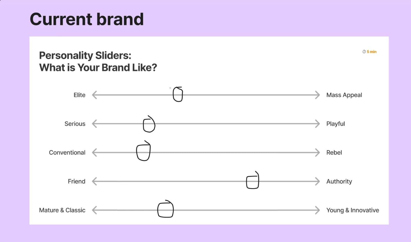
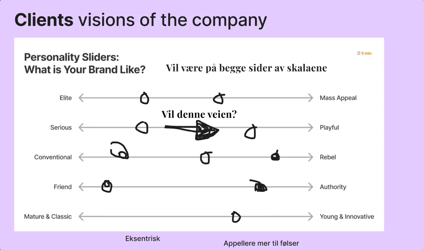
Andreas first placed the brand where he felt it was today, then where he wanted it to go. Today it read as fairly serious, conventional, classic and an authority. The vision pulled toward playful, eccentric and younger, with more appeal to feelings, while still speaking to a premium audience. His own summary was the most useful line of the day: "Vil være på begge sider av skalaene", he wants to be on both sides of the scales.
Six Stylescapes, Three Directions
Since Andreas wanted to sit on both sides of the scales, I made the options clearly different. Two first stylescapes on 20 August, then a second round of six, grouped into three directions. Each one shows the same content in a different voice: hero, typography, colour, imagery and buttons.
His first reactions were concrete: he preferred Playfair over Poppins, and he did not like black. Inter became the body font from that meeting on.
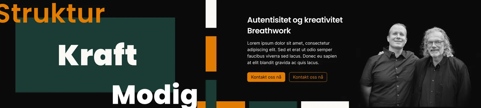
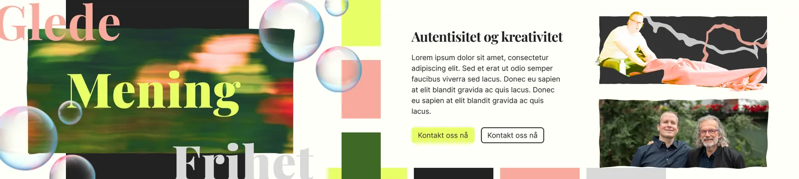
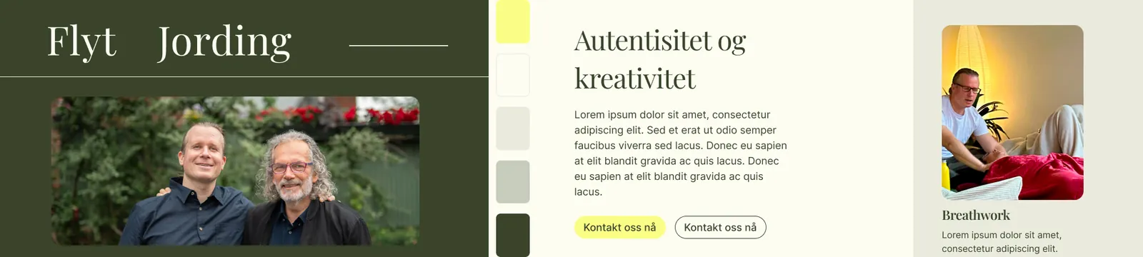
Testing the directions on a real page
Stylescapes are good for talking about feelings but bad at showing how a long page reads. On 2 September I put the directions on the landing page structure, with real headlines, lists and testimonials. Seeing them side by side settled it for me: mature the layout, add whitespace, and let go of the black version.
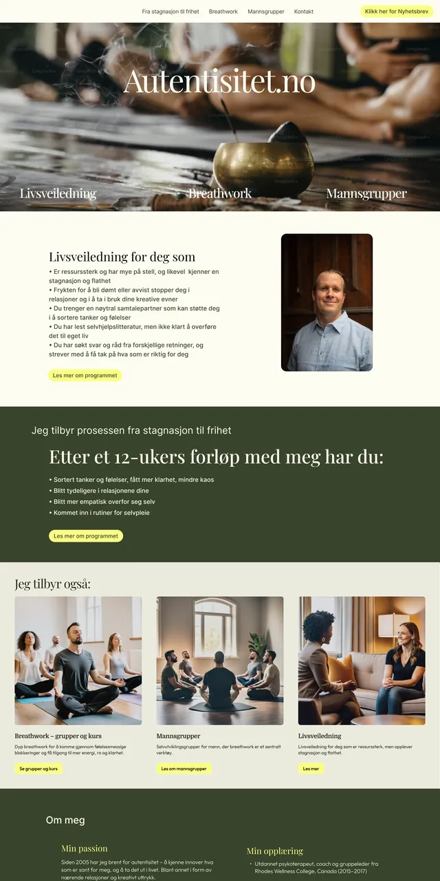
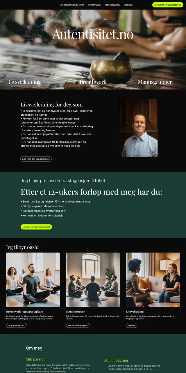
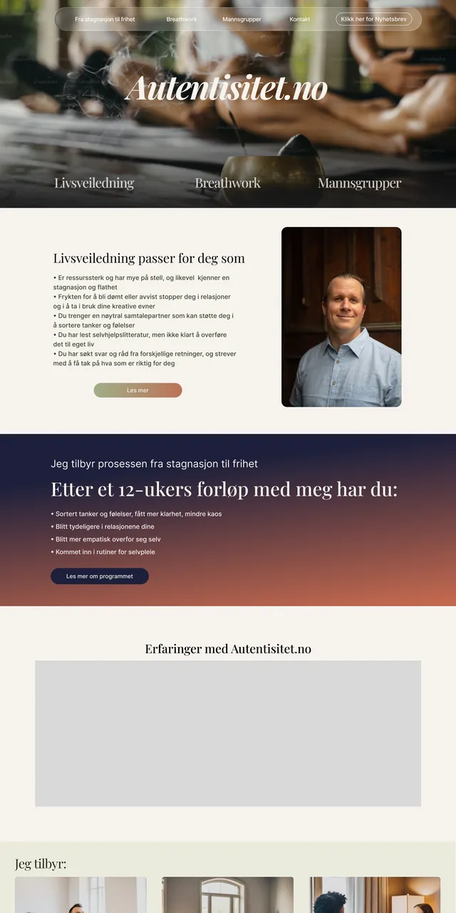
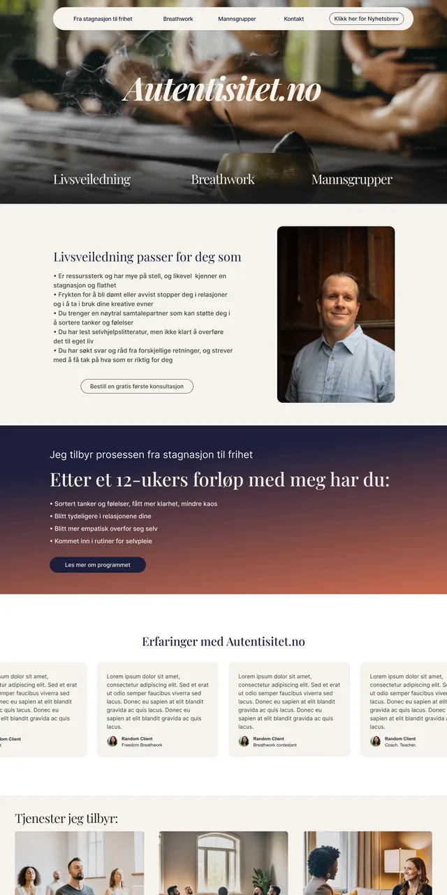
Mixing a new green
With 01 too dark and 02 too loud, the calm third direction became the base, and the job was to keep it from being bland. I had two candidate greens: a reference green that was a nice shade but too warm and muddy, and a suggestion with exactly the right depth that was a touch too cold. So I mixed one in between, then matched a yellow to it and built the background and text shades from the pair.
Selling the direction
For the presentation on 5 September I chose not to jump straight to the final page. I planned it as a walk through the process: the first stylescapes, the next round, and then the final version, so the choice would feel earned. I presented the result as a combination of three of the stylescapes, with a green that is both serious and grounded. Andreas also warmed to one of the lighter directions. The note I sent with the delivery the next day kept it short:
"The palette combines the earthy, serious deep green with a warm, energetic yellow that we mostly use for calls to action. It gives the site calm and authority, with one clear point of light and warmth where we want to lead attention."
Delivery note to Andreas, 6 Sep 2025 (translated)
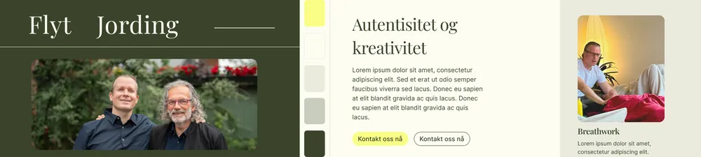
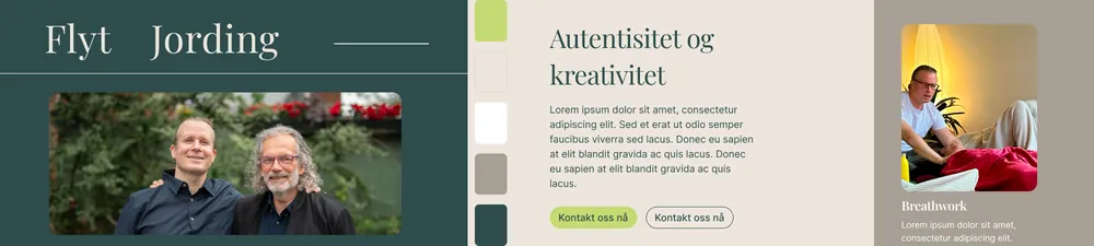
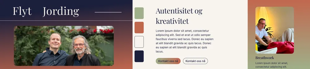
The Final Direction: Stylescape F
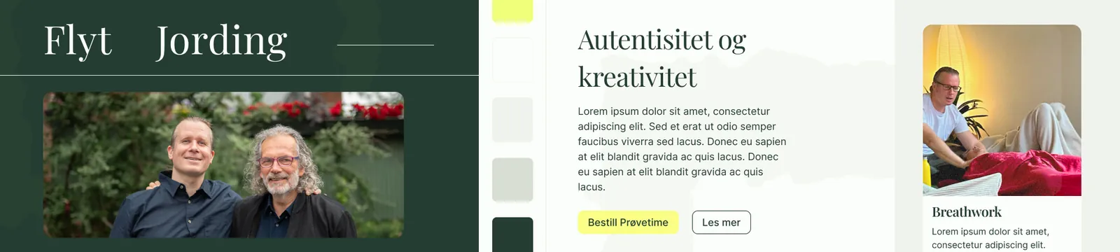
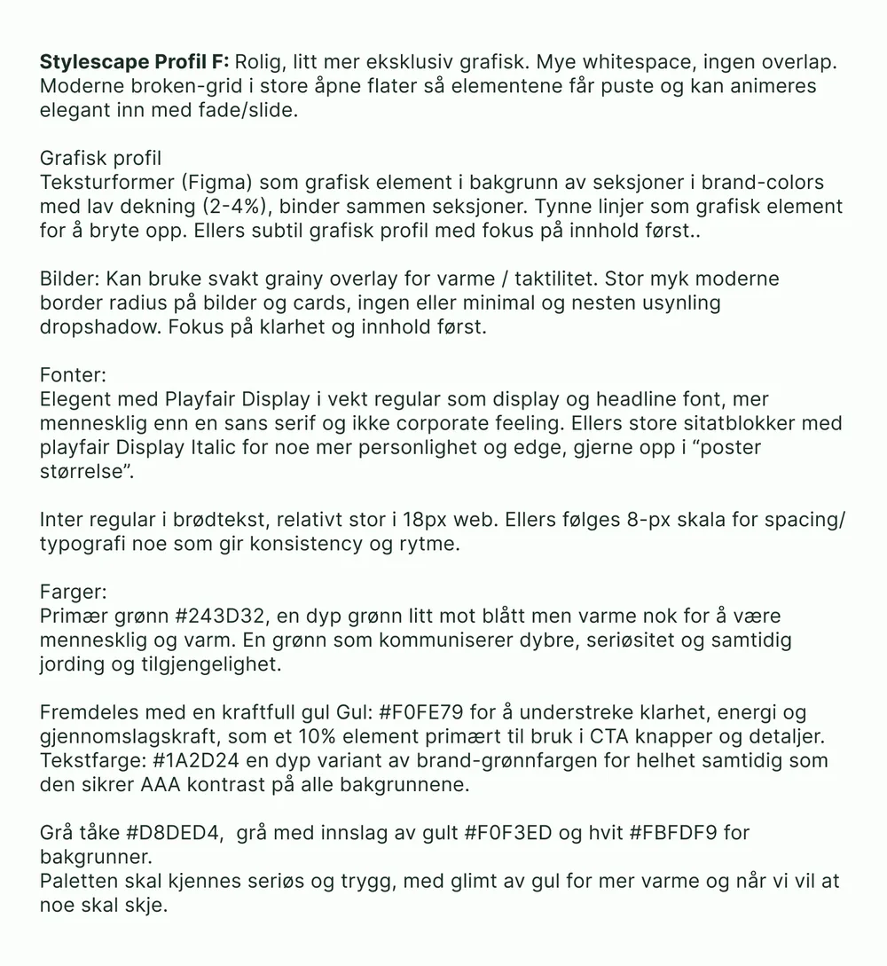
The final stylescape came with a short written rationale, so every later decision could point back to it. The same text later became the starting point for his social media.
Feeling
Calm and a little more exclusive. Lots of whitespace and no overlapping elements. A modern broken grid in large open areas, so content can breathe and fade or slide in gently.
Graphic elements
Organic texture shapes behind sections at 2–4% opacity tie the page together. Thin lines break things up. A faint grain on photos adds warmth, with large soft corners and no drop shadows.
Typography
Playfair Display Regular for headlines: more human than a sans and never corporate. Playfair Italic for big quotes. Inter at 18px for body text, on an 8-px scale for spacing and type.
Colour
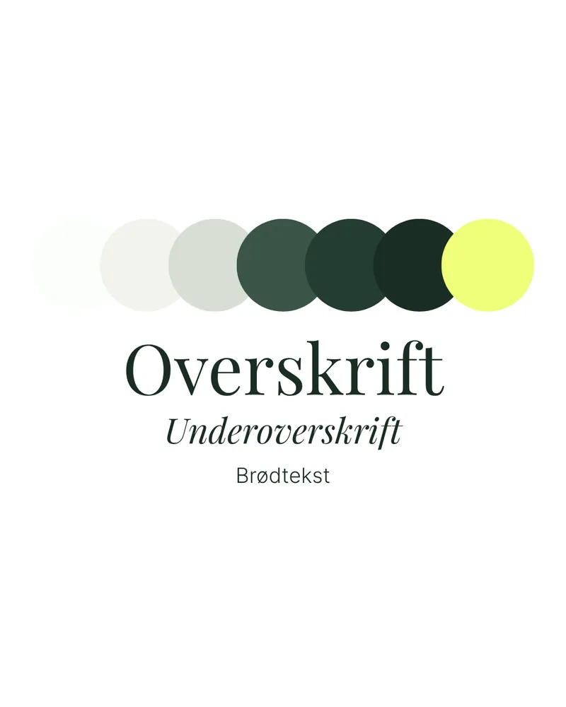
- #243D32 Primary green. Deep, serious, grounding
- #3A5547 Secondary green
- #1A2D24 Text. AAA contrast on every background
- #F0FE79 Yellow. About 10%, for buttons and details
- #D8DED4 Mist
- #F0F3ED Warm grey
- #FBFDF9 Off-white
Designing the Landing Page
Iterating in Figma
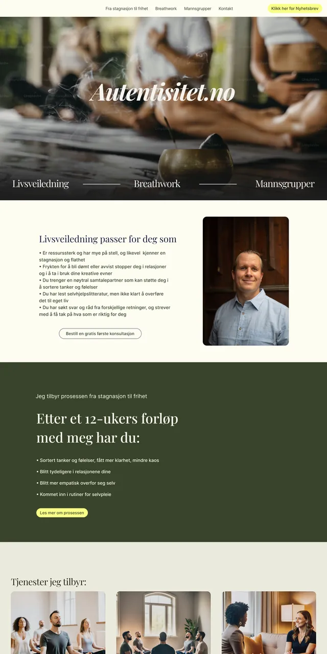
The landing page went through many rounds over two weeks. The building blocks stayed the same: who it's for, the 12-week programme, testimonials, the other offers and who Andreas is. The order, the density and the colours changed a lot.
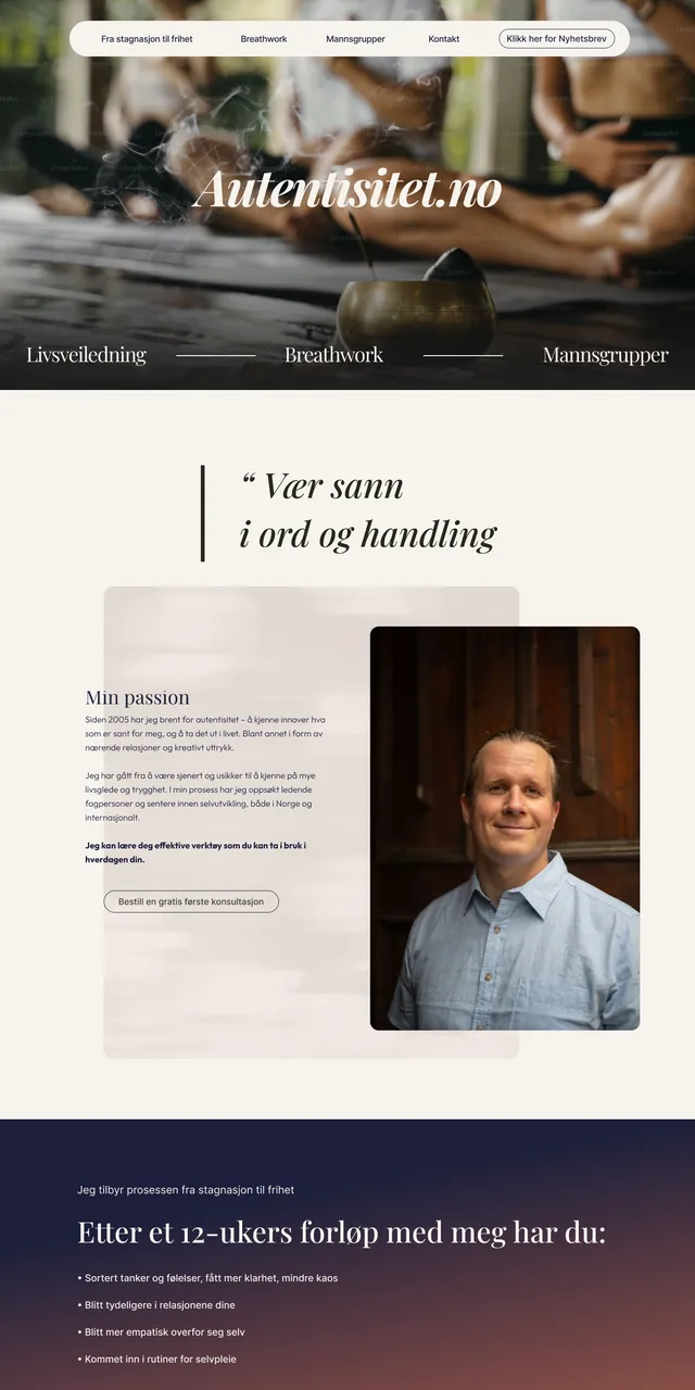
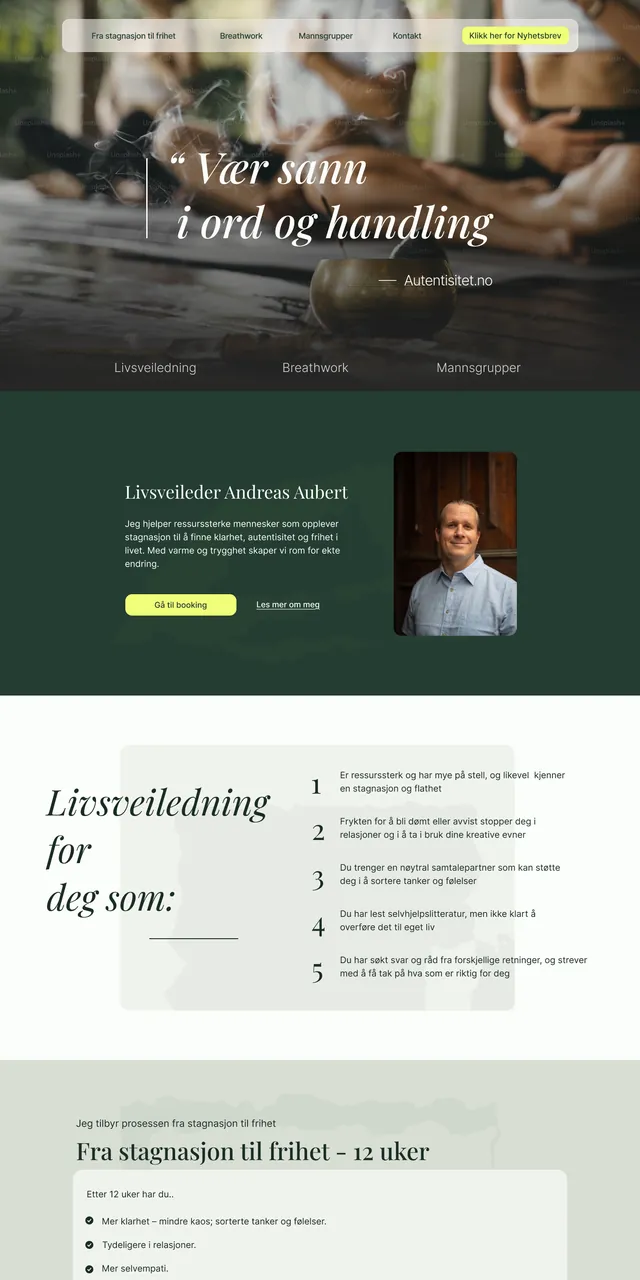
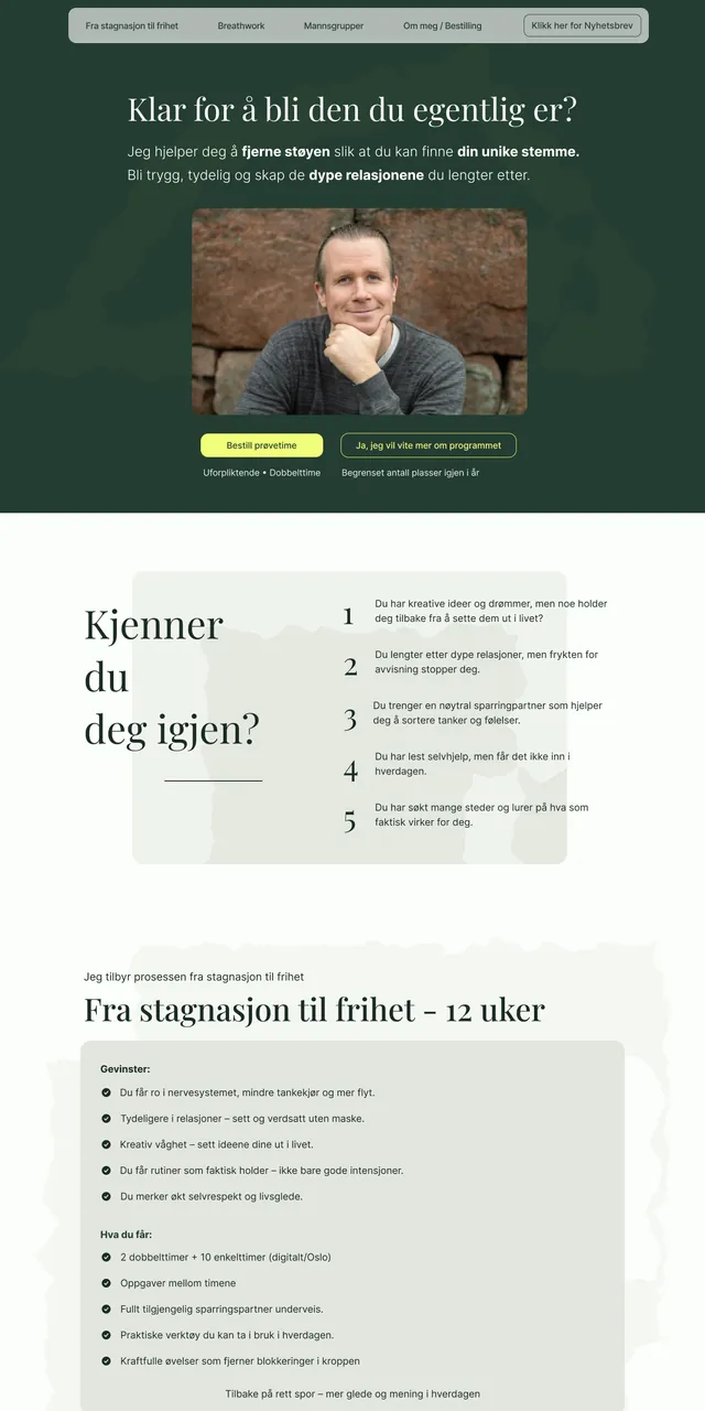
Three rounds of feedback
The biggest changes came from listening, not from polishing.
- 7 Sep User test and first meeting I user tested the page with a friend. Speak to "you" instead of "I", fewer menu items, real photos of Andreas instead of stock and AI images, and one clear action: book a paid trial session, not a free chat.
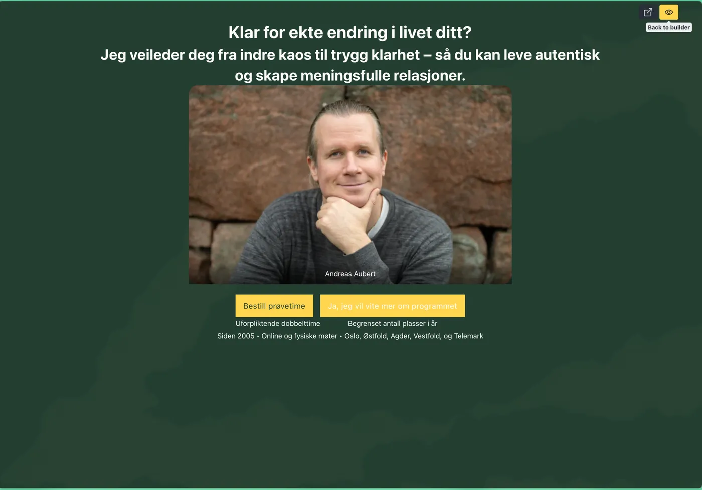
- 12 Sep His business course mentor She liked the colours and design, but the hero I had designed hid the most important thing. The page should open with Andreas himself, a clear value proposition and a button, and sell the 12-week programme as the main product. I rebuilt the page around that the next day.
- 16 Sep Andreas' own notes He wanted "online and physical meetings" and his regions visible right away. Putting that in the headline would have weakened it, so I added a small proof strip at the bottom of the hero instead: "Siden 2005 • Online og fysiske møter • Oslo, Østfold, Agder, Vestfold og Telemark".
Every change, explained
I delivered the revised page on 15 September with notes in the margin, written so Andreas could follow the reasoning and pick up terms like CTA along the way:
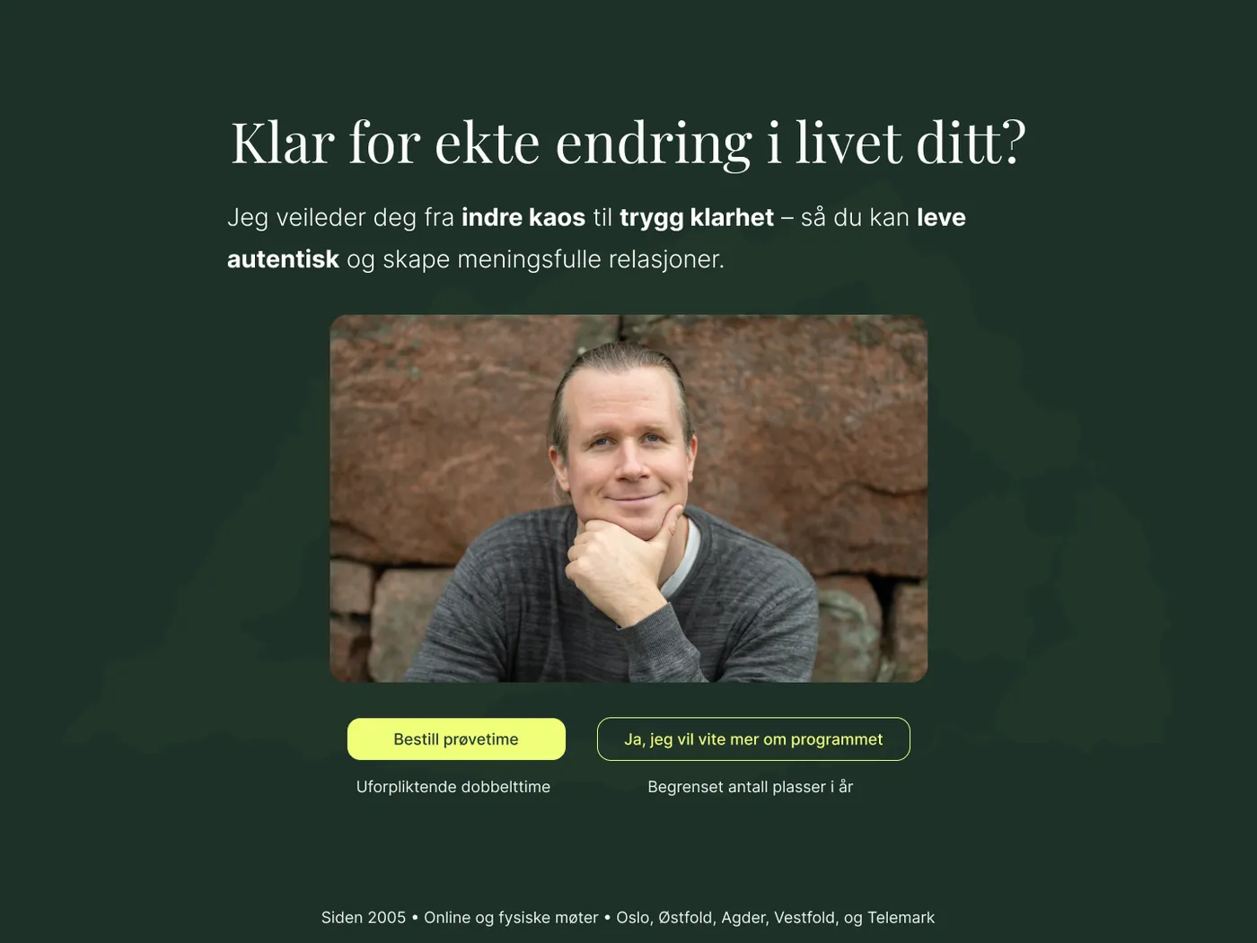
- New hero. Clearer focus on what you get, with Andreas as the face of it. Two clear buttons and a gentle note that places are limited.
- "Kjenner du deg igjen?" Five pain points the reader recognises, tied straight to the solution: the 12-week programme.
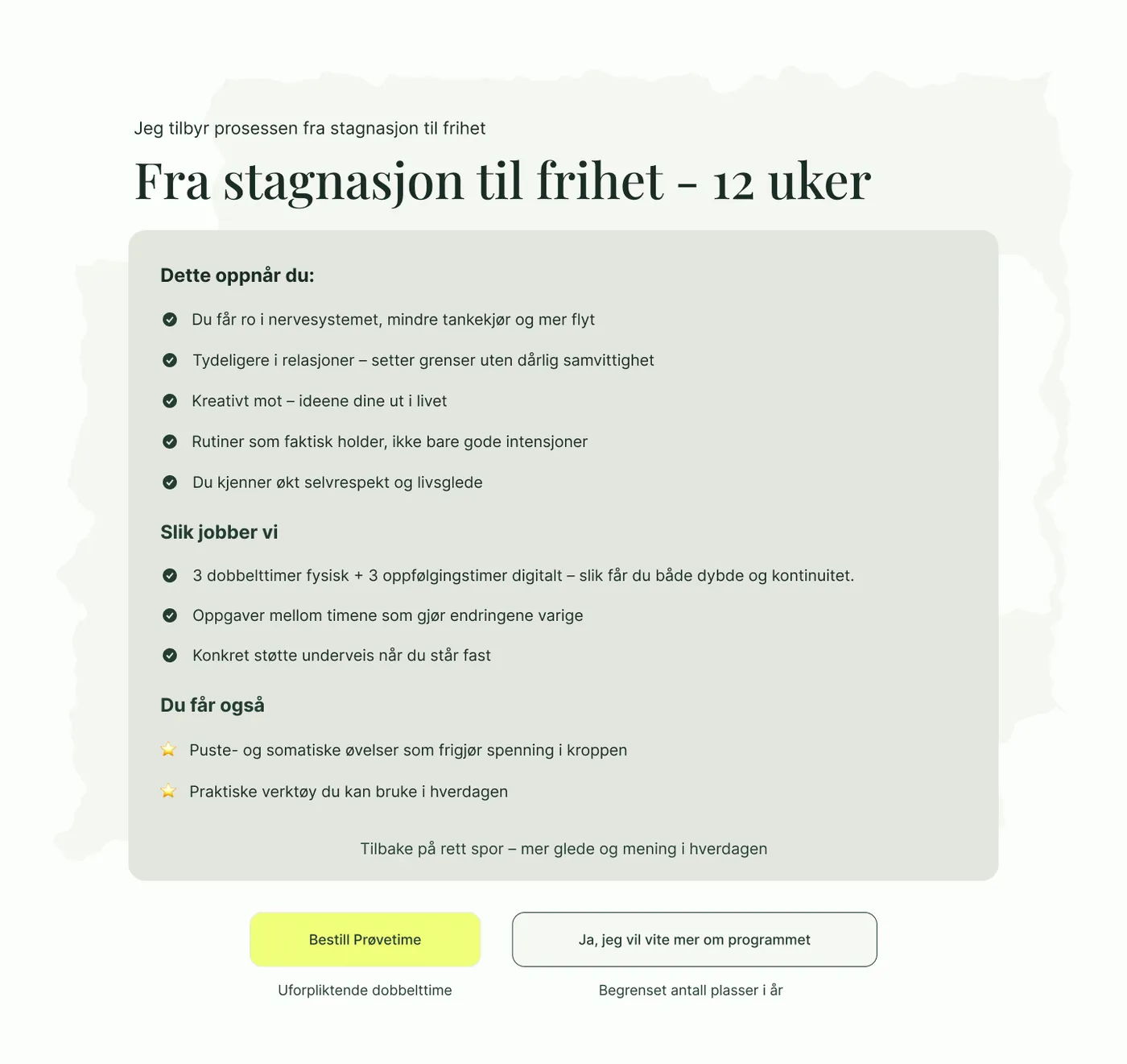
- Main offer clarified. What you gain, how we work and what's included.
- Trust moved up. Testimonials moved higher and trimmed to their strongest lines, to avoid a wall of text.
- Lead magnet. A free 5-minute guided breathing session in exchange for an email address (not yet shipped).
- Calmer About section. His training folded into accordions, with a booking button added.
- Secondary offers. Breathwork and men's groups as cards that lead to their own pages.
- Mentor quotes. A second trust section with short quotes from his teachers.
- Offer repeated. The programme again near the end, with small trust markers.
- FAQ to answer doubts before they stop a booking.
- Newsletter as a last catch for visitors who aren't ready yet.
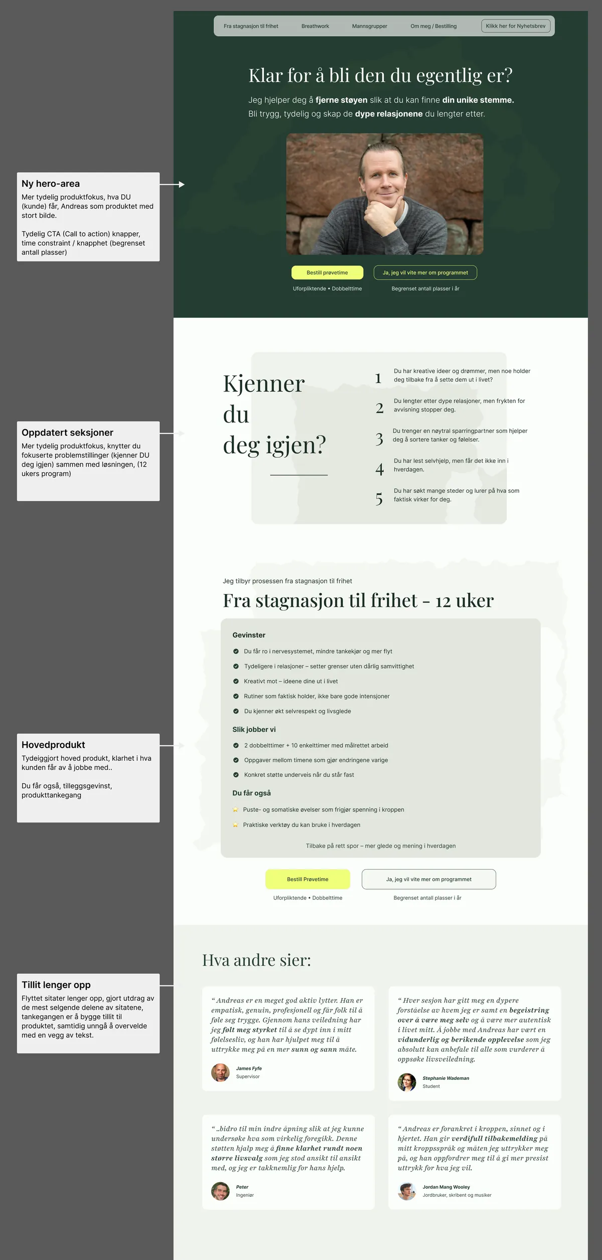
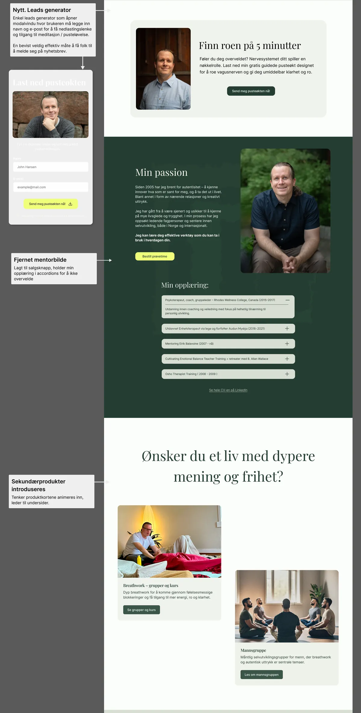
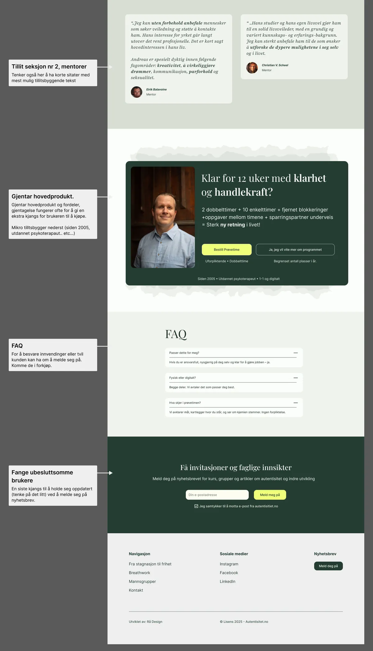
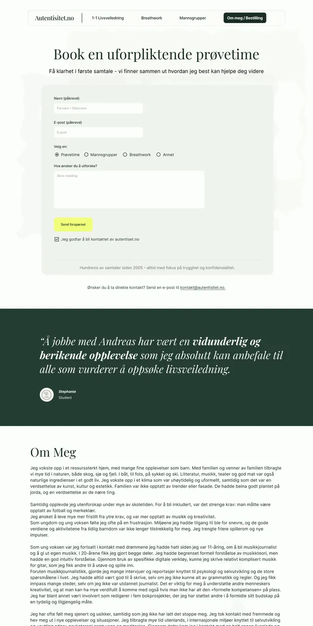
Portrait hero with value proposition and two buttons, proof strip, "Kjenner du deg igjen?", the 12-week offer, testimonials, secondary offer cards, FAQ, newsletter signup and a low-friction contact form.
Rolling the system out
With the landing page settled, I made the Men's Groups page the template for the rest, and the same building blocks became four more pages in about a week: Breathwork, Men's Groups, Life Coaching and Contact. Each follows the same rhythm: a hero with one action, quick facts, the story, a testimonial, an FAQ and a closing call to action. On the contact page the form is the whole point: as little friction as possible, with trust elements below it and a plain email address for people who don't like forms.
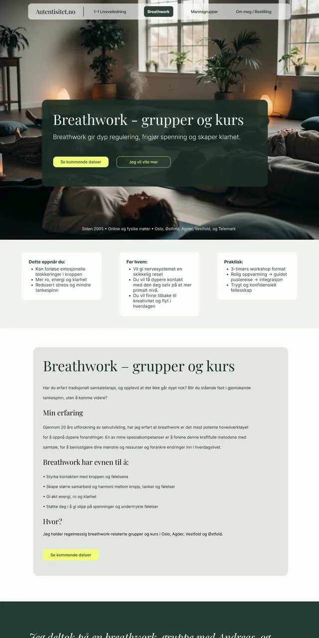
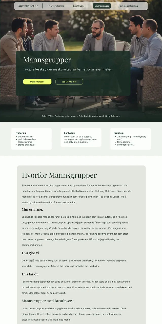
One Brand, Every Surface
My main priority was that people recognise Andreas wherever they meet him: on the website, on Instagram, on a Facebook event and in the room. The website is only one of those surfaces.
Handing the brand to his social media manager
In September Andreas started working with Malene at Social by Malene, who writes his posts and builds them in Canva. I sent her Stylescape F with the rationale for fonts and colours, plus a few Instagram accounts that do this well. A compact brand document, so the brand stays consistent on every platform.
Her drafts picked up the colours and fonts right away. To give her more to work with, I made brand-coloured background textures with the same subtle grain as the website, and we refined the templates together.
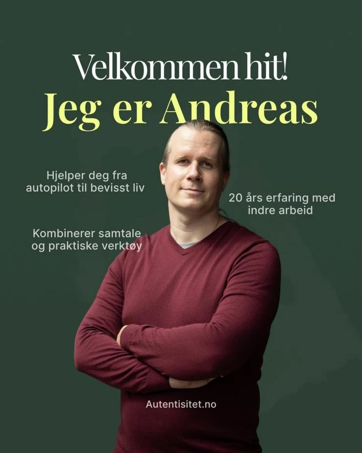
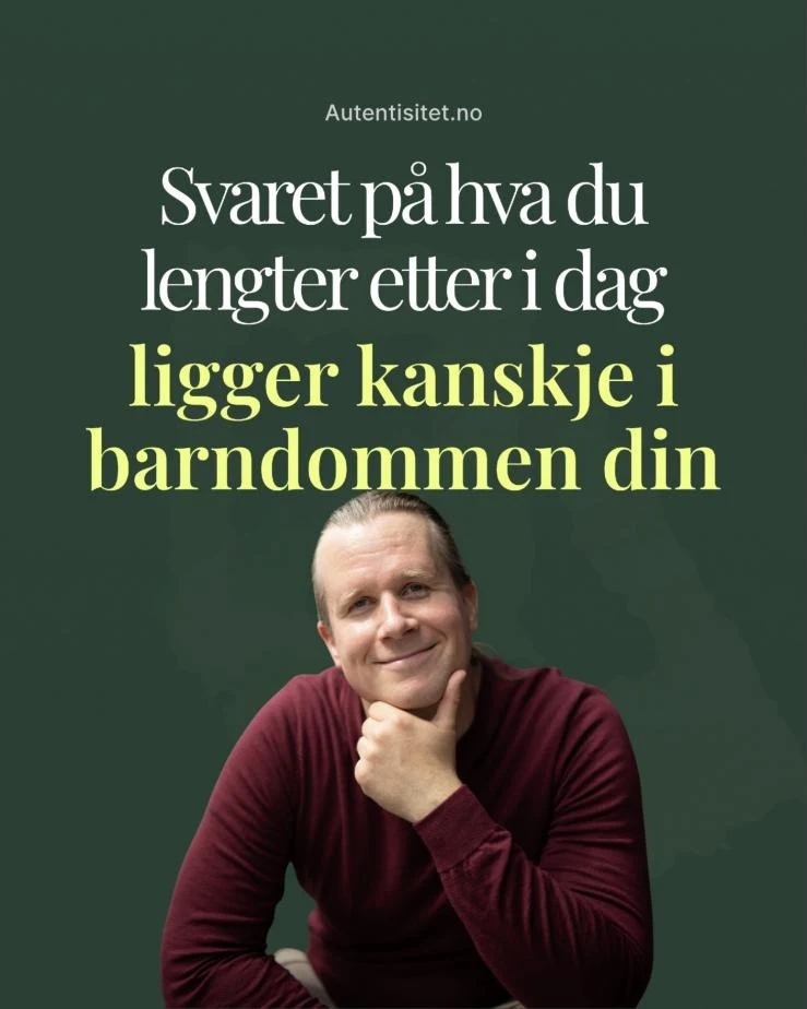
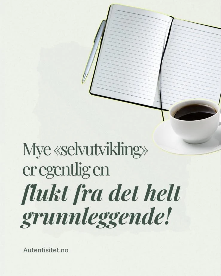
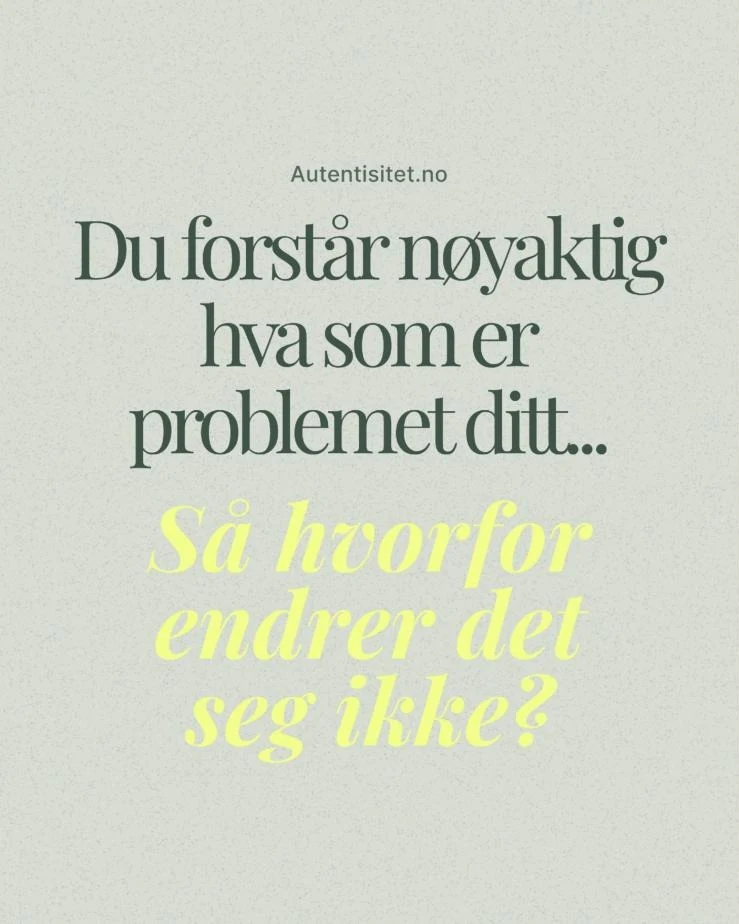
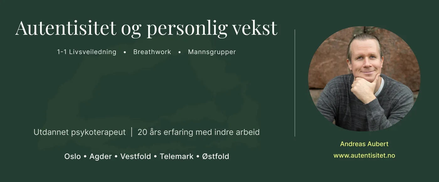
Making our own photos
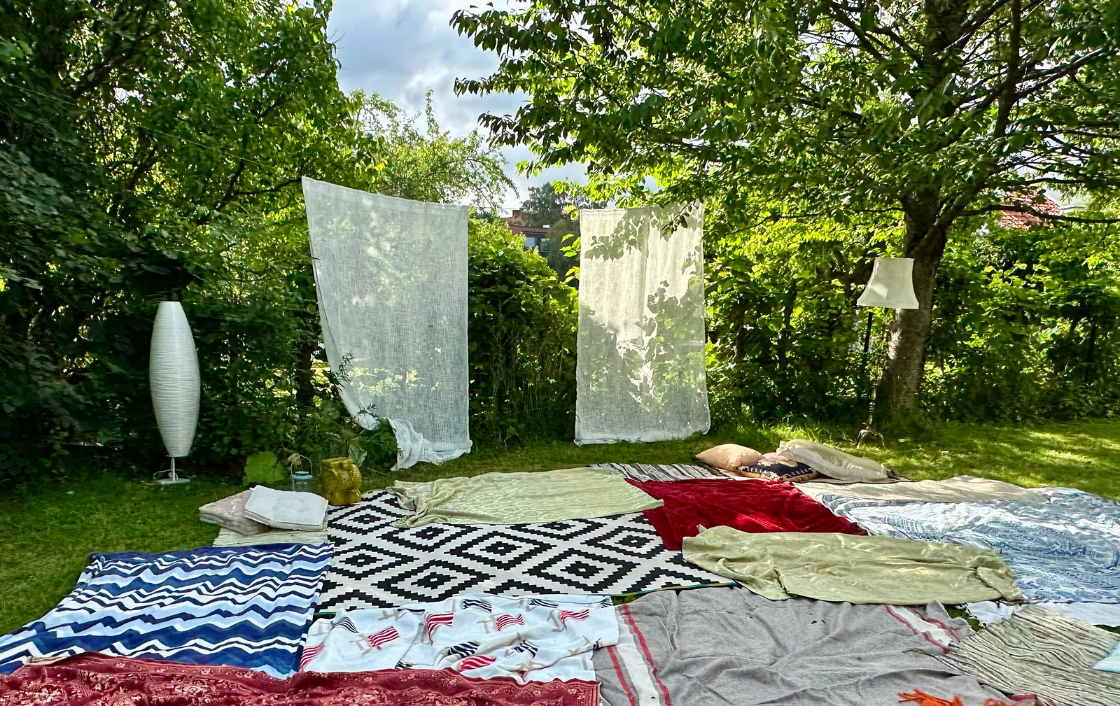
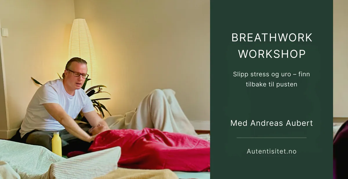
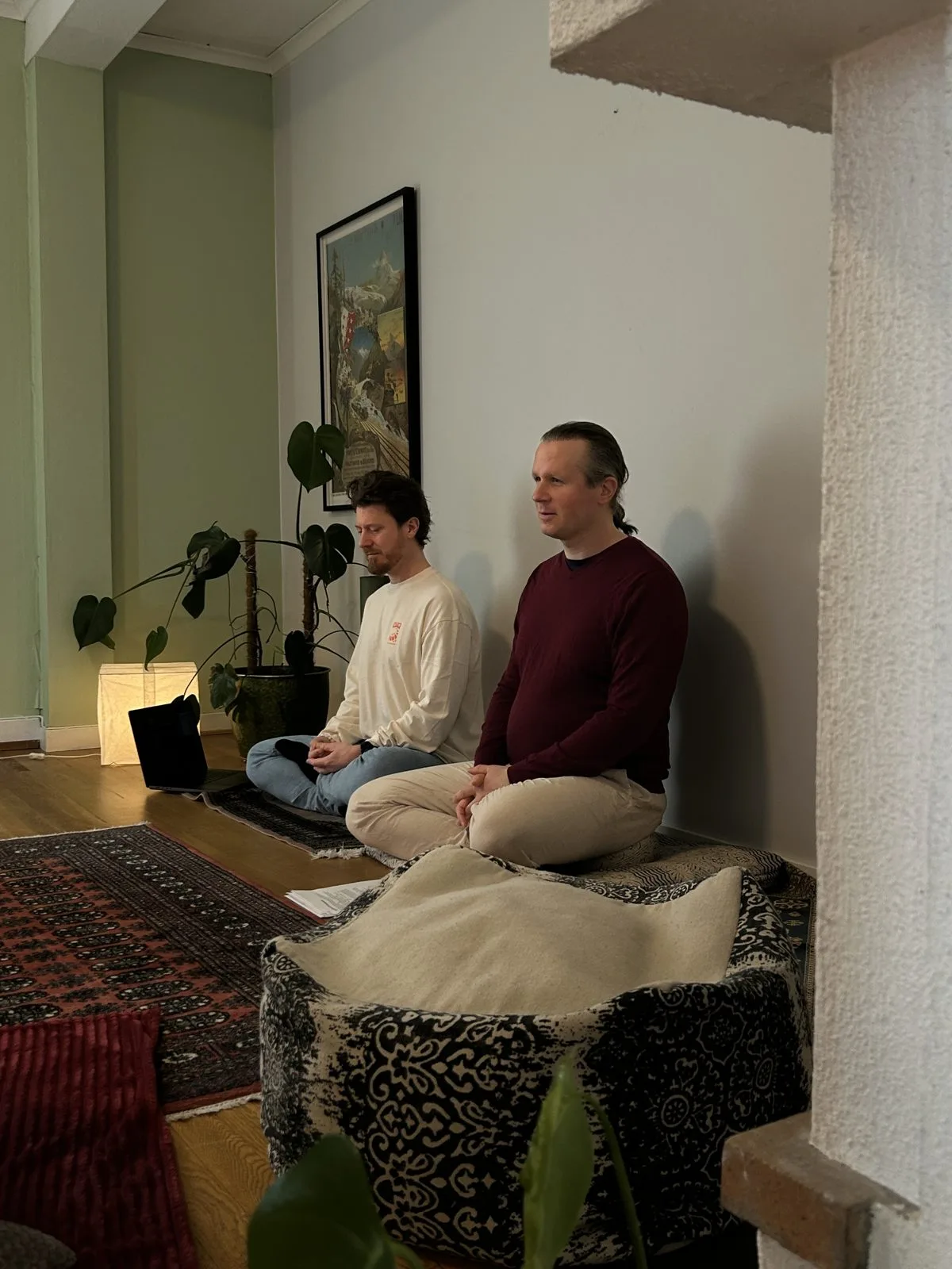
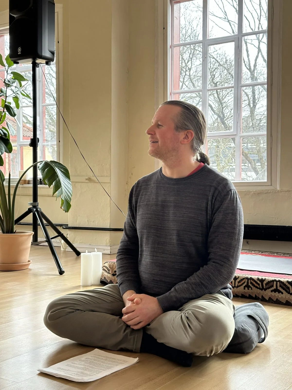
Real photos of Andreas at work were the biggest gap. From the 7 September meeting the rule was clear: no stock or AI images, and consent from participants before using photos from events. So we turned his breathwork sessions into photo shoots as well. I co-hosted the first one in our garden, set up with blankets, cushions and lamps between the trees, and the photos from these sessions now carry the website, the event banners and Instagram. For the next session we added music. People loved it.
Building for Speed with Bricks
Choosing the tool
The site stayed on WordPress so Andreas can keep editing his own content. I compared Bricks, Breakdance, Oxygen and SeedProd. Breakdance had more ready-made blocks; Bricks won on lean output and performance. Iterating in a builder is slower than iterating in design, so Andreas and I settled the design in Figma first and I built it once.
A small CSS framework of my own
I spent two days weighing Automatic.css with Frames against Core Framework, and then rolled my own: Tailwind-style utility classes on top of design tokens taken straight from the stylescape. Later I added simple rules for widths, so I never had to think about them again: 896px for focused content, 1120px for wide sections, and about 810px for long reading.
:root {
  --color-primary:   #243D32;
  --color-secondary: #3A5547;
  --color-accent:    #F0FE79;
  --color-text:      #1A2D24;
  --container-lg: 896px;
  --container-xl: 1120px;
}

.d-1 {
  font-family: 'Playfair Display', serif;
  font-size: clamp(2.25rem, 8vw, 5rem); /* 36 → 80px */
  line-height: 1.08;
}
From Figma to Bricks
Work in progress: screenshots from the first days of the build, section by section. The finished pages are shown under Results.
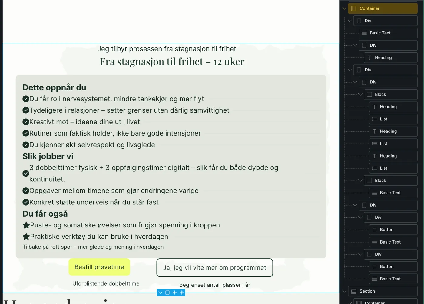
Staging and launch
The old site stayed live while I built on a password-protected copy at dev.autentisitet.no, set up by hand over FTP with indexing blocked. On 17 October the new site went live.
Launch day: 67 on mobile
The first PageSpeed test after launch gave 67 on mobile and 98 on desktop, with a Largest Contentful Paint of about 10 seconds. A big part of it was my own hero rule, which forced the first screen to be at least 1240px tall. Fixing that came first, then:
- Preload the hero image as WebP, with separate files for mobile and desktop, plus only the two fonts above the fold.
- Remove the Bricks icon font I never used, plus its colour-palette stylesheet and the empty child-theme CSS.
- A small script of my own loads Hotjar only after the page has finished loading. We get the analytics, and the page stays fast.
- Long cache headers on static assets.
- Turn the video testimonial into a click-to-play facade with a WebP poster. That took the Breathwork page from 84 to 99.
// functions.php (simplified)
add_action('wp_head', function () {
  if (!is_front_page()) return;
  // LCP hero: one file per breakpoint
  preload('image', 'bgheronymobil.webp', '(max-width: 478px)');
  preload('image', 'bgherony2.webp',     '(min-width: 479px)');
  // Only the fonts needed above the fold
  preload('font', 'playfair-display-400.woff2');
  preload('font', 'inter-400.woff2');
}, 5);
Technical SEO
- FAQPage schema on every page with an FAQ, plus business and video schema.
- Page titles and descriptions written for local searches like "breathwork i Oslo".
- 301 redirects from the old site's URLs (/counselling/, /mentoring/, /testimonials/, /breathwork-2/ and more) to their new homes.
- Google Business Profile and Search Console set up after launch.
An Events Calendar Andreas Runs Himself
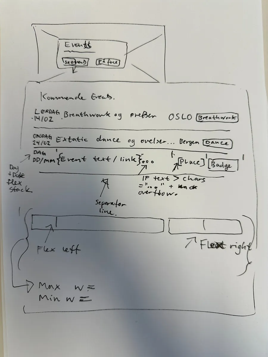
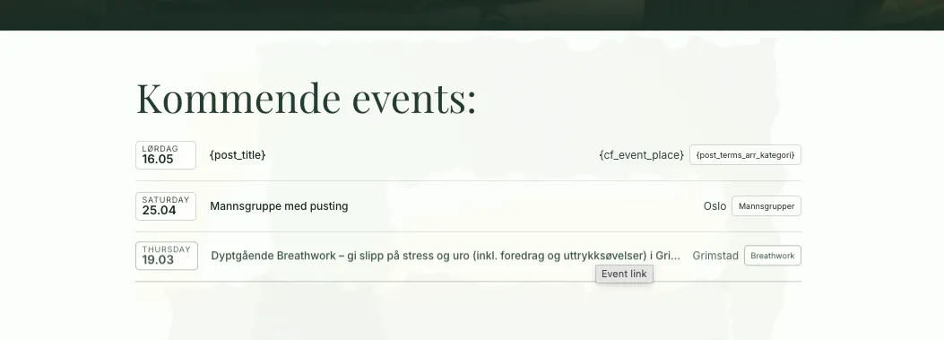
In February 2026 Andreas asked for a proper events page. Until then, his workshops and men's groups around Oslo, Agder, Vestfold, Østfold and Telemark were a hand-edited list of links in a text block.
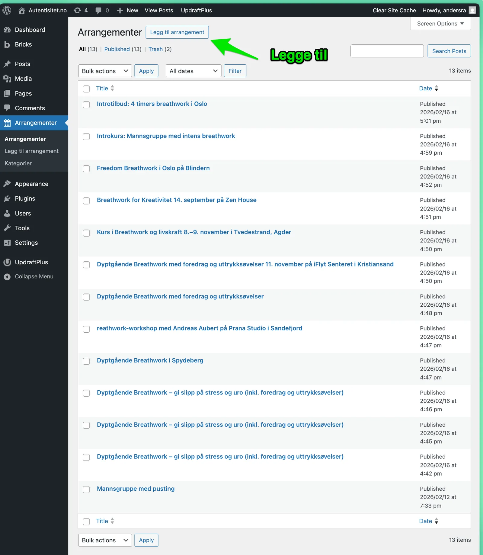
The site runs on Bricks with my own CSS and very few plugins, and I wanted to keep it that way. So instead of reaching for ACF, I wrote a small must-use plugin: a custom post type, Arrangement, with three fields (date, place and link) and three categories. A Bricks query loop renders the list. Two shortcodes print the Norwegian weekday and date ("Fredag 19.03") and a heading for each month, and events more than two months old fold away behind a "Vis eldre events" button.
register_post_type('arrangement', [
  'public'      => true,
  'has_archive' => true,
  'rewrite'     => ['slug' => 'arrangementer'],
  'menu_icon'   => 'dashicons-calendar-alt',
]);

// Fields: event_date · event_place · event_url
// [aut_event_daydate]       → "Fredag 19.03"
// [aut_event_month_heading] → "Mars 2026"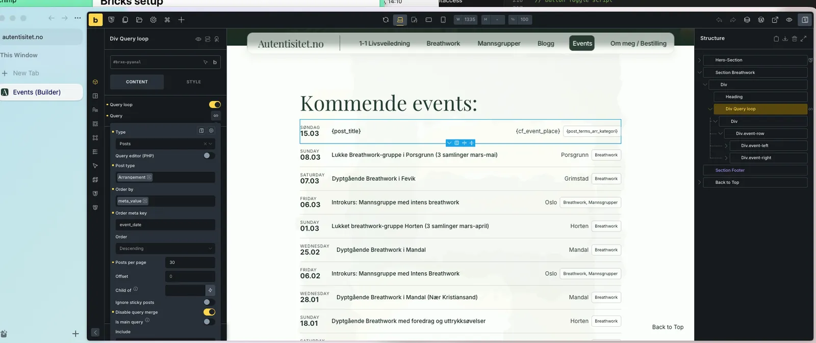
The same approach carried the rest of phase two: a blog page, and newsletter signups wired straight from Bricks forms to Kit, then moved to Mailchimp when Andreas switched providers, still without a plugin.
Results
PageSpeed Insights
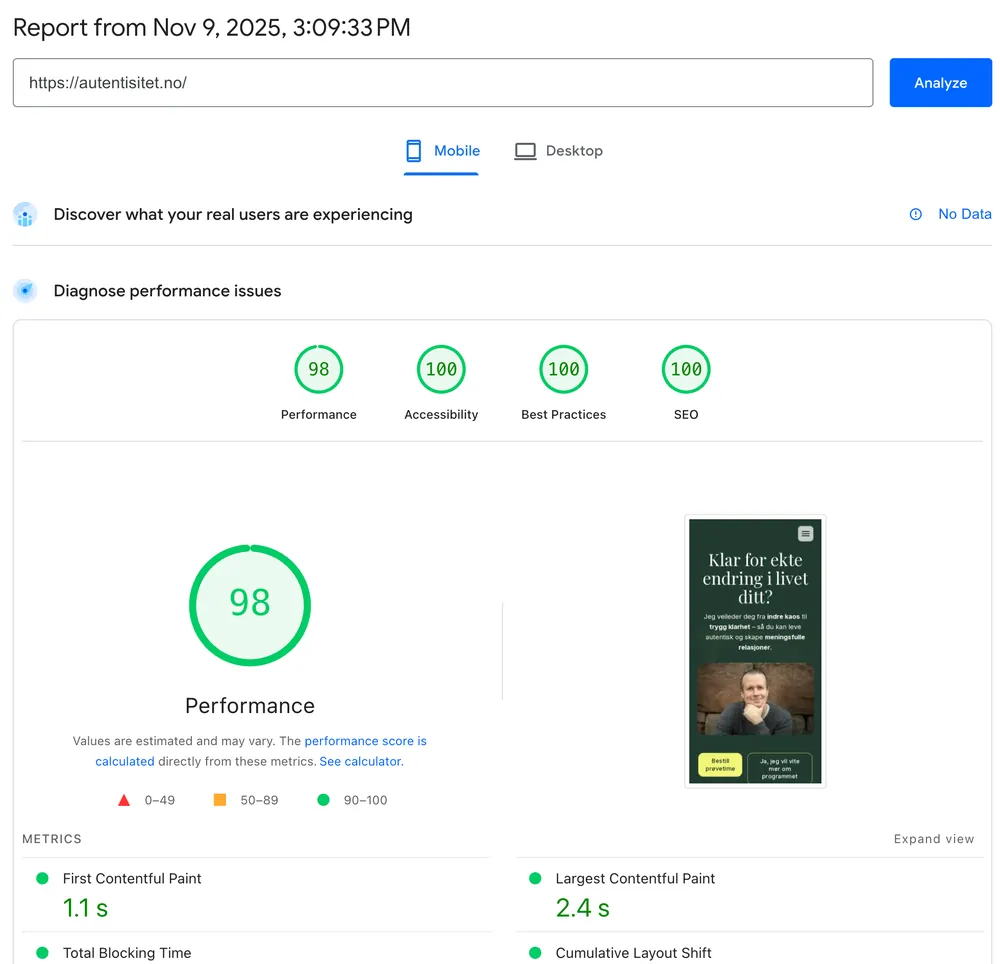
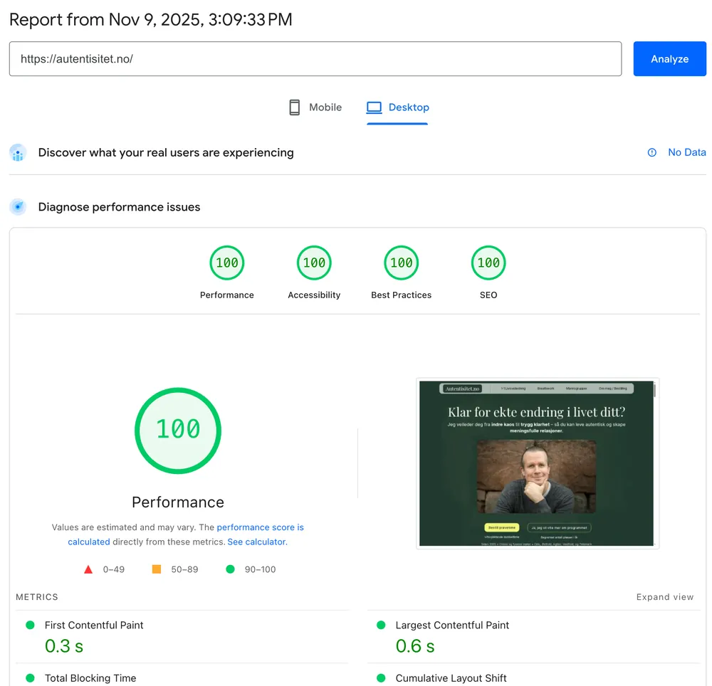
From 67 on mobile on launch day to 98–100 three weeks later. Tested on 9 November 2025, on the front page and on the Breathwork page, which carries a video testimonial.
- Front page · Mobile from67 to 98 Performance · 100 Accessibility · 100 Best Practices · 100 SEO LCP from about 10 s to 2.4 s
- Front page · Desktop 100 Performance · 100 Accessibility · 100 Best Practices · 100 SEO LCP 0.6 s
- Breathwork page · Mobile from84 to 99 Performance · 100 Accessibility · 100 Best Practices · 100 SEO LCP 1.9 s
- Breathwork page · Desktop 100 Performance · 100 Accessibility · 100 Best Practices · 100 SEO LCP 0.6 s
Found in search, and by AI
Within weeks of launch, the site showed up where Andreas' clients actually look:
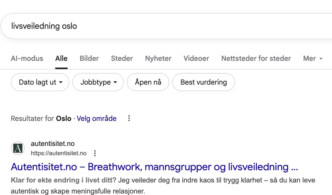
- #1 on Google for "livsveiledning oslo".
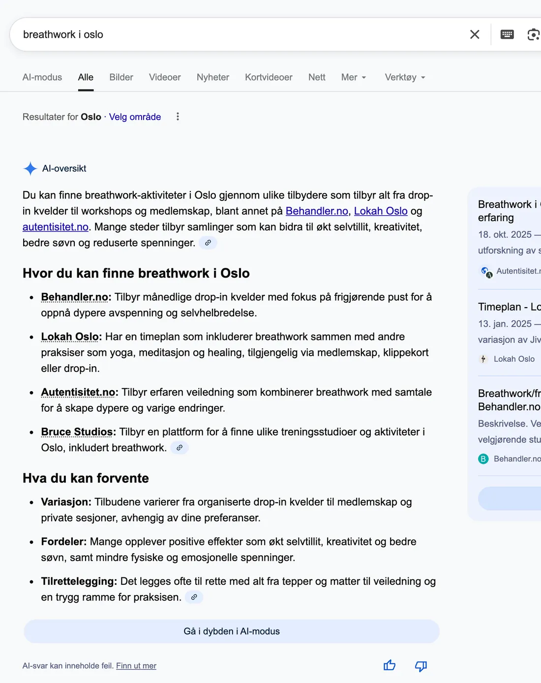
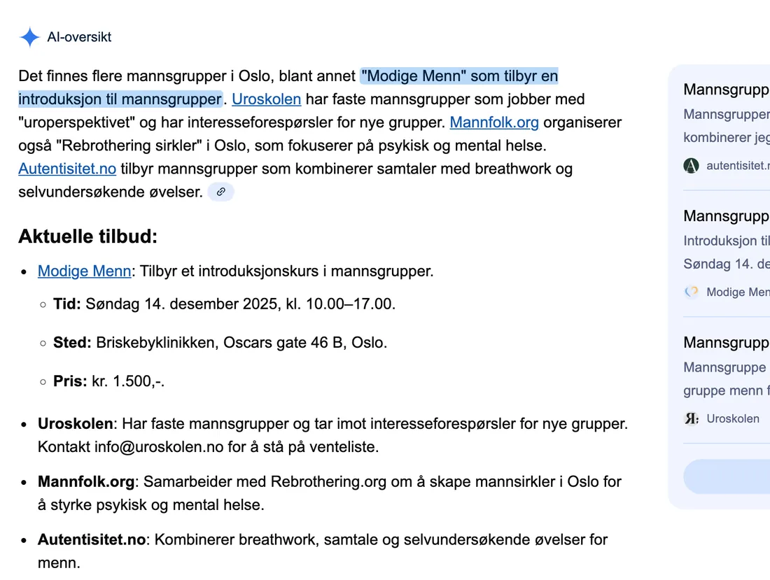
- Named in Google's AI Overview for both "breathwork i oslo" and "mannsgrupper oslo".
- "breathwork oslo" moved from page 3 to pages 1–2 after the video and schema fixes.
An outside view
"Good text, good flow, clear buttons."
Mathilde Junge, reviewing the site in a web meeting, 11 Nov 2025 (translated)
And the rooms are full
The real measure is people in the room. Andreas' breathwork events now fill up, and participants love the sessions. Between July 2025 and January 2026 his events list included sessions in Oslo, Tvedestrand, Kristiansand, Horten, Sandefjord, Spydeberg, Mandal and Grimstad.
Reflections & Learnings
- Values lead to visuals. Every design decision traces back to the exploration: the workshop gave the values, the values gave the stylescapes, and the stylescapes gave the palette, type and layout. The result is anchored in who Andreas is, not in my taste.
- Show the path, not just the answer. Walking Andreas through the stylescapes before the final page made the choice feel like ours, not mine.
- Test on a real page. The stylescapes started the conversation. Seeing them on the actual landing page made the decision.
- Feedback moves a design further than fine-tuning. One round of outside feedback put Andreas and his offer at the top of the page.
- Explain decisions in the client's language. Annotations in the margin turned a design review into a conversation about selling his programme.
- Performance is a design decision. Fonts, image sizes and how video loads are choices made long before the build.
- Bricks suits clients who need custom solutions and top performance. It gives me full control of the markup and CSS, and Andreas still edits his own content in WordPress.
- Fewer tools, less friction. A small CSS framework of my own and almost no plugins made every later change predictable.
- Seeing the whole journey. As designer, developer and co-host of his events, I could follow a visitor from an Instagram post to a full room.