#Coding
Migrating my portfolio from Wordpress to SvelteKit part 1: planning and design.
Migrating from Wordpress to developing a Sveltekit page with Tailwind and Sanity as a headless CMS.
Published at October 17, 2024
After Hyper Island I wanted to improve my portfolio. I also wanted to learn more front end development and Javascript frameworks. I was happy with Semplice portfolio builder, but Wordpress added bloat and I could not seem to get the performance I wanted, also, I wanted to add custom solutions. My requirements for the build were ease of development, getting the very best performance, and improved design.
Planning from the end goal:
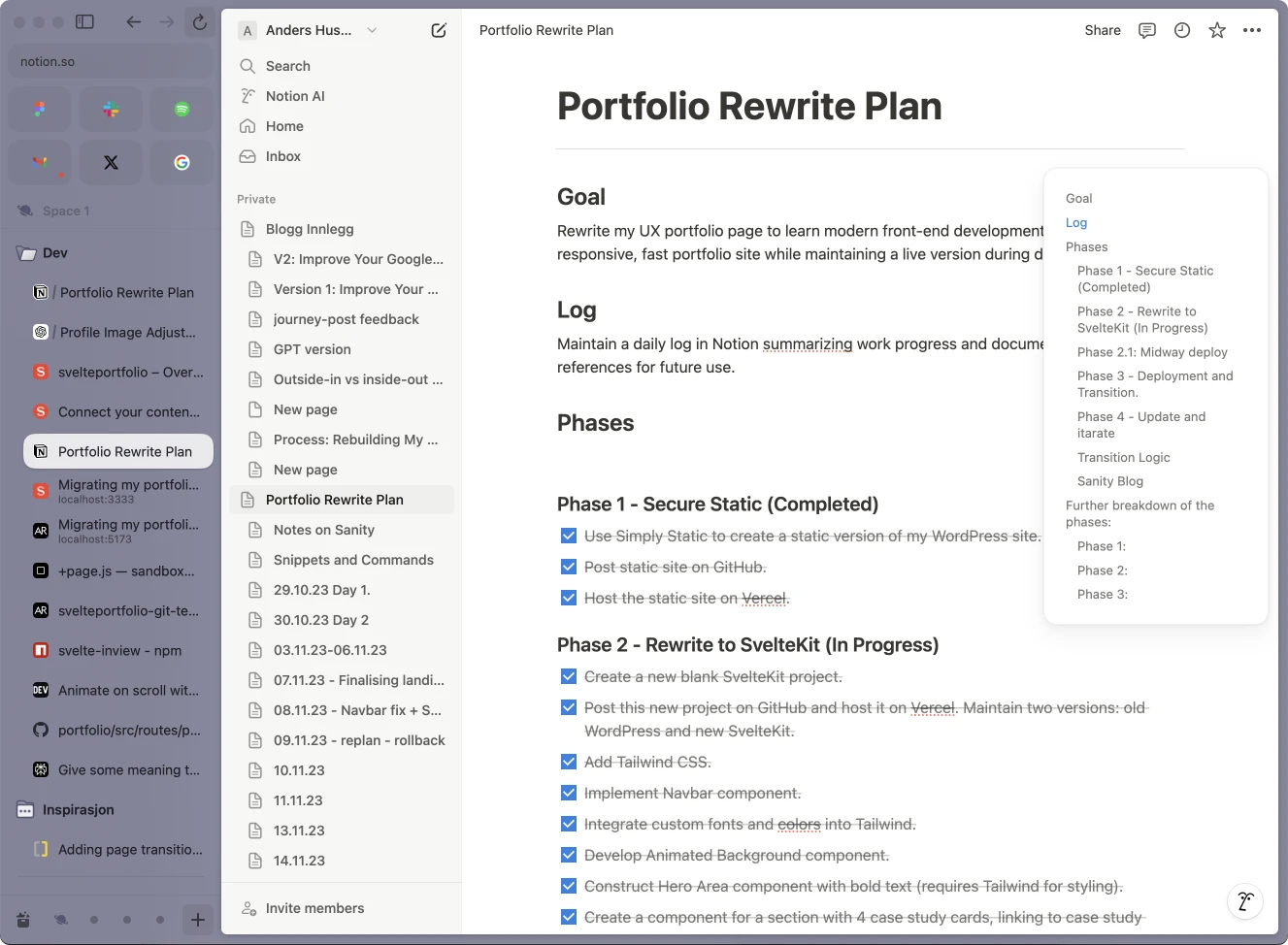
Great planning is often the start of a successful project! At Hyper Island, I learned to plan from the end goal. For my portfolio, I began by defining clear objectives and then broke each goal into phases. Each phase had a checklist of achievable tasks, which helped me avoid feeling overwhelmed. By focusing on one task at a time and checking them off daily, I could see steady progress, keeping me motivated throughout the process.
Notion and the ARC browser:
To stay organized, I used Arc—a fantastic browser for creating focused workspaces. It allowed me to keep my development environment clean and distraction-free. I tracked my entire process in Notion, which served as my central planning tool. Notion’s built-in AI even provided feedback and suggestions, helping me refine my plans and make informed decisions along the way.
The best tech stack:
I did a lot of research into what tech to use. Many developers I have worked with seems to prefer Next (React), but after digging trough documentation for SvelteKit I was sold that it would be both more versatile, quicker to learn and give me the top notch performance I was after! For styling I went with Tailwind and for managing blogposts and testimonials, I wanted to set up Sanity as a headless CMS.
Instead of an expensive hosting plan, I fount out that I could deploy my site for free with Vercel, an excellent, super fast cloud platform!
More super portfolio plugins:
- Svelte-SEO for the best SEO.
- GSAP for animations.
- Image zooming with Lightgallery. An excellent plugin showing images in the same way as in articles on the popular Medium platform.
- Hotjar, MS-Clarity and GA4 for analytics, to see how recruiters interact with the portfolio.
- Partytown for sideloading this analytics so they dont ruin the page performance.
Design refresh, and adding a killer feature:
I refreshed my design by doing a quick brand exploration to define my values and communicate them using colors and fonts that I felt represented my values.
The dynamic navbar
I wanted a novel killer feature that set my portfolio apart, and showcased my focus on interaction design. That is how I came up with developing the dynamic nav-bar with the animated "effect" that moves and resizes based on what section of the page is currently in view. It was inspired by a mobile menu with four icons, this idea came to life as a cutting-edge interaction element. I was one of the first to develop this feature, which has since been adopted by Framer and many other popular pages. Here is a few iterations, from the ideation and to the latest version:

My second killer feature is the animated background with the moving gradients on the frontpage. I designed it to be a subtle effect, making the page slightly more lifelike while not distracting too much from the main content of the page.
Colors
I developed my color palette to embody seriousness and creativity. I use 60% muted blue-gray for a sense of professionalism, 30% dark slate blue for depth and authority, and 10% bright red to signify creativity, strength, and passion. These colors harmonize with who I am as a designer and leader.
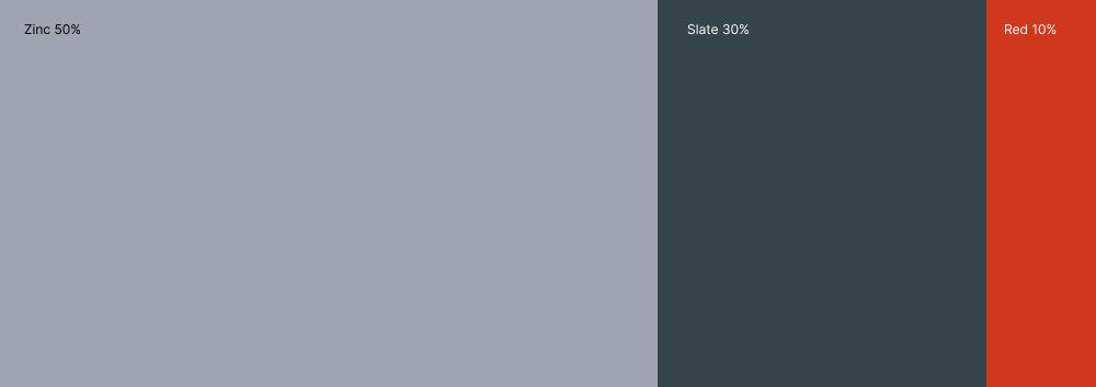
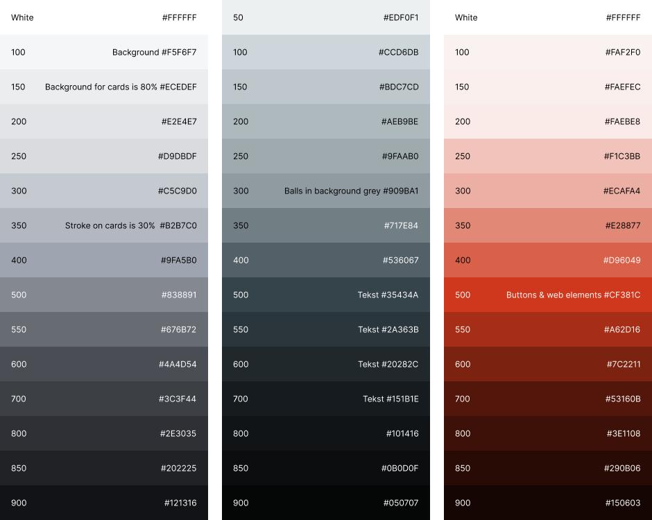
I am a proponent of using shades of the brand colors for graphical elements like shades and text, this color injection makes the design more lively, subtle yet effective. Here is how I set my color scale up for Tailwind.
Typography
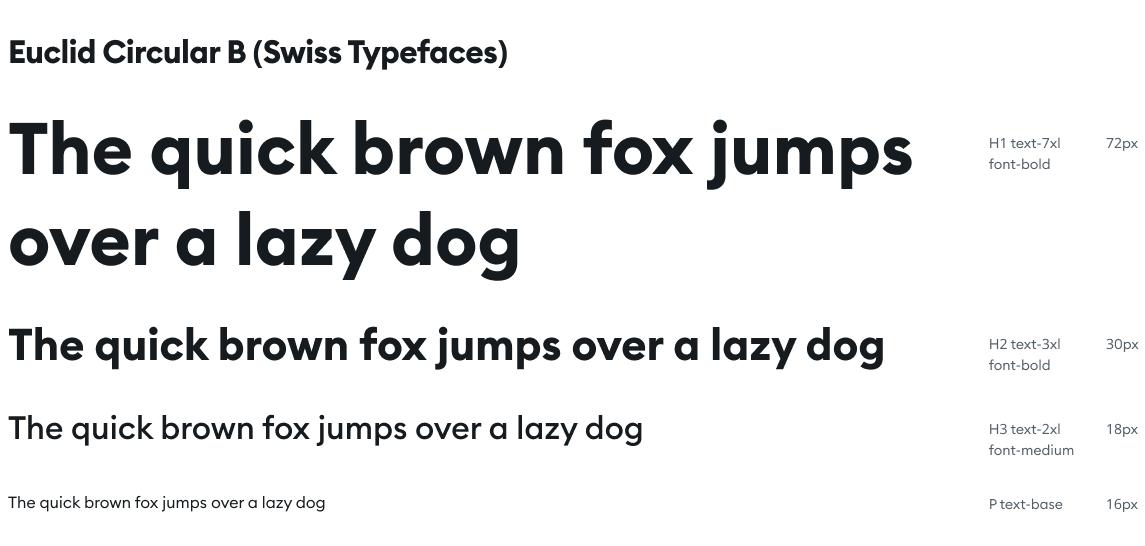
For fonts I love the geometric sans serif Euclid Circular B from Swiss Typefaces, its clean, elegant and has a open feel to it. Super important for me when picking a font is that it works perfect with its default settings, there should be no need to adjust spacing or kerning for the font to look ok. This way I can also rely on Tailwinds default sizes when coding. Here is how I use Euclid in my case studies:
In the next post, I will write more about code, going deep into my development process, and give some top key takeaways you can learn from my experience.